


To make a scatter plot in Google Sheets, put your X values in the first column and the matching Y values in the next one, select both columns with their headings, choose Insert > Chart, then open Chart type in the Chart editor and pick Scatter chart. Sheets drew a column chart from our two columns of numbers first, so that last step is the one that turns the bars into dots.
We plotted steps against minutes for twelve walks, then added a second route, our own titles and a trendline with its equation. Two things surprised us along the way: Add Series only lists the columns already inside the chart's data range, and the R² = 1 that Sheets printed in the legend is a rounded number.
The short version
- Make the chart: select the X column and the Y column with their headings, then choose Insert > Chart.
- Get dots, not bars: in Setup, open Chart type and pick Scatter chart from the Scatter group.
- Check the axes: X-axis in Setup should name your first column, and Series the column you are plotting against it.
- Add a second set of dots: click Add Series, and if the column is missing from the list, use the grid icon at its top to type the column's range.
- Add a line of best fit: in Customize > Series, tick Trendline, set Label to Use Equation and tick Show R².
Scatter plot settings at a glance
| What you want | Where to set it | What we got |
|---|---|---|
| Dots instead of bars | Setup > Chart type > Scatter chart | Twelve dots against two number axes |
| A second set of dots | Setup > Add Series, or the grid icon in its list for a column outside the range | Red dots beside the blue ones, and a legend naming both routes |
| Your own chart and axis titles | Customize > Chart & axis titles > Title text | Steps by walk length on top, Steps up the side |
| Bigger or different dots | Customize > Series > Point size and Point shape | Set to 7px and Circle when we opened it |
| A line of best fit | Customize > Series > Trendline | A straight line through one set of dots |
| The line's equation | Trendline Label > Use Equation, plus Show R² | 109*x + -38.1 R² = 1 in the legend |
Set up your data for a scatter plot
A scatter plot needs two columns of numbers that belong together. Put the X values, the ones you set or count first, in the first column and the Y values in the column to its right. Each row becomes one dot, placed across by its X value and up by its Y value, and every further number column becomes another set of dots.
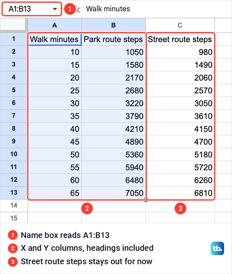
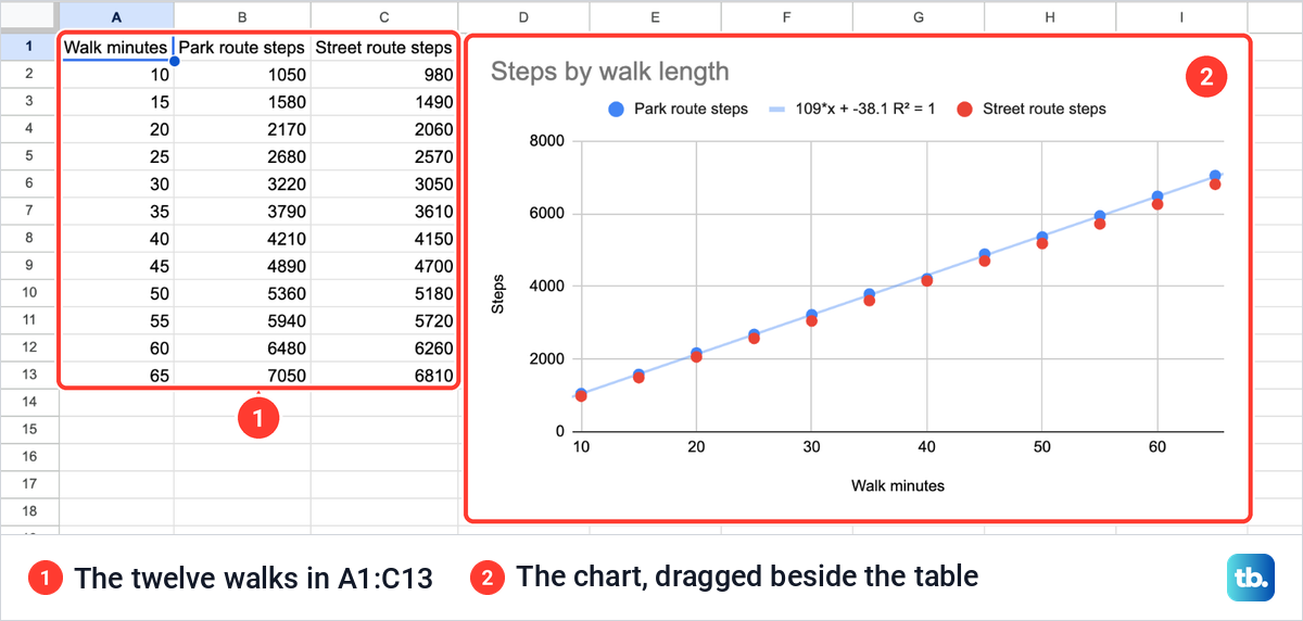
Our sheet, Walking Routes, logs twelve walks: Walk minutes in column A from 10 to 65, Park route steps in column B and Street route steps in column C, all typed as numbers. The headings in row 1 become the names in the chart's legend, so rename columns in Google Sheets before you chart them if a heading would read badly there.
Keep each walk on one row. A row pasted twice is plotted twice, one dot on top of the other, so remove duplicates in Google Sheets if a paste went wrong, and on a long log freeze the heading row so the column names stay in view as you scroll.
If your first column holds names rather than numbers, such as categories or people, a scatter chart is the wrong tool, because it needs a number to place each dot across the chart. Make a bar graph in Google Sheets to compare categories, use a pie chart in Google Sheets for shares of a whole, and our guide to making a graph in Google Sheets covers the other chart types.
Now select the cells. Click the first heading, hold Shift and click the last number of the Y column. We selected A1:B13, Walk minutes and Park route steps with both headings, and the Name box at the top left read A1:B13.
How to make a scatter plot in Google Sheets
With the range selected, open the Insert menu and choose Chart. Sheets puts a chart on the sheet and opens the Chart editor on the right, with a Setup tab and a Customize tab.
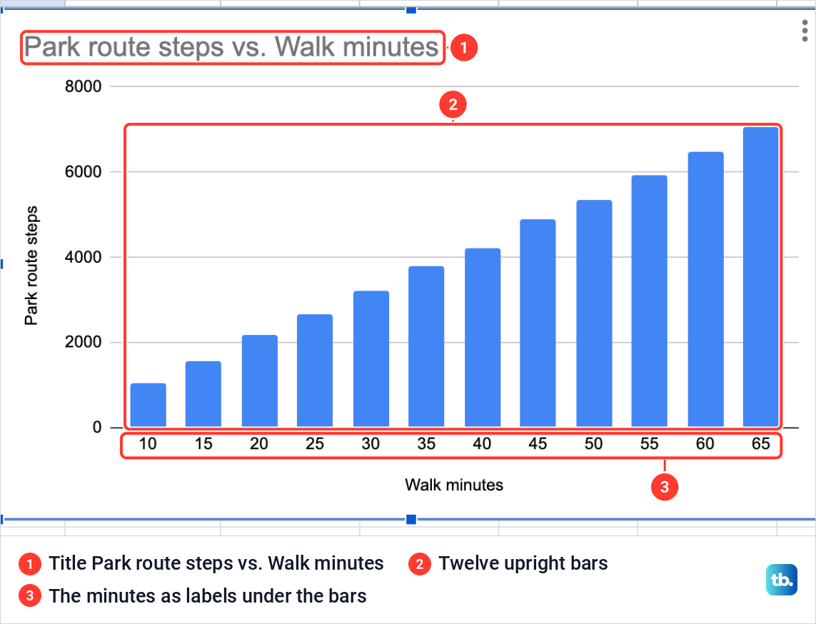
The chart Sheets drew for us was not a scatter plot. Even with two columns of numbers it chose a column chart: twelve blue bars titled Park route steps vs. Walk minutes, with the minutes printed under the bars as labels rather than placed on a number scale.
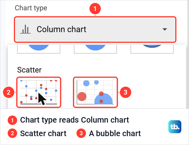
So the first job is to change the type. Click the Chart type box, which read Column chart, and scroll down the list past Pie to the Scatter group. It has two thumbnails: the first is Scatter chart, and the second, with circles of different sizes, is a bubble chart.
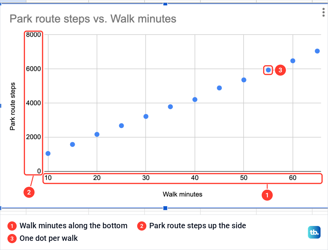
Click Scatter chart. The bars turned into twelve dots against two number axes, Walk minutes along the bottom with 10 to 60 marked and Park route steps up the side from 0 to 8000. The dots climb from left to right, which is the pattern a scatter plot is for: the longer the walk, the more steps.
Check the X axis and the series
Before you style anything, look at Setup, because it shows which column Sheets put where. Ours read Chart type Scatter chart, Data range A1:B13, X-axis Walk minutes and, further down, Series Park route steps. Under them, Use row 1 as headers and Use column A as labels were ticked, and Switch rows / columns was not.
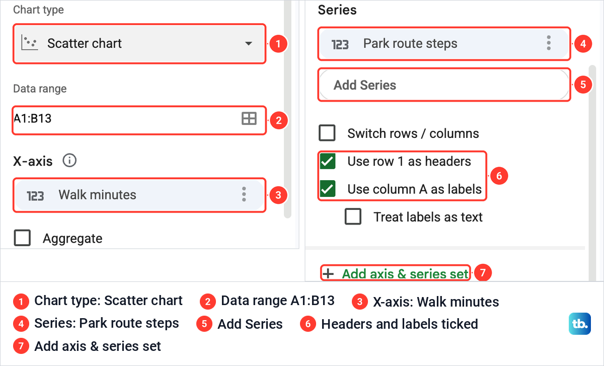
That is why two selected columns give one set of dots. The first column is not plotted as a series of its own: it supplies the X position of every dot, and only the columns after it become series. If the wrong column sits under X-axis, click the three dots in that box and choose Remove, then click Add X-axis and pick the right column from its list.
Add a second set of dots to the same chart
To compare the street route with the park route, the chart needs column C as a second series, so add a column in Google Sheets beside your Y values if the second set of numbers is not there yet. If you are starting fresh, select all three columns, A1:C13, before you choose Insert > Chart, since every number column after the first becomes its own set of dots.
On a chart that already exists, scroll Setup down to Series and click Add Series. With our data range still A1:B13, the list offered only Walk minutes and Park route steps. Street route steps was not there, because Add Series lists only the columns inside the chart's data range.
The way round it is the small grid icon at the top right of that list. It opens Select a data range, where we typed C1:C13, the street route column with its heading, and clicked OK.
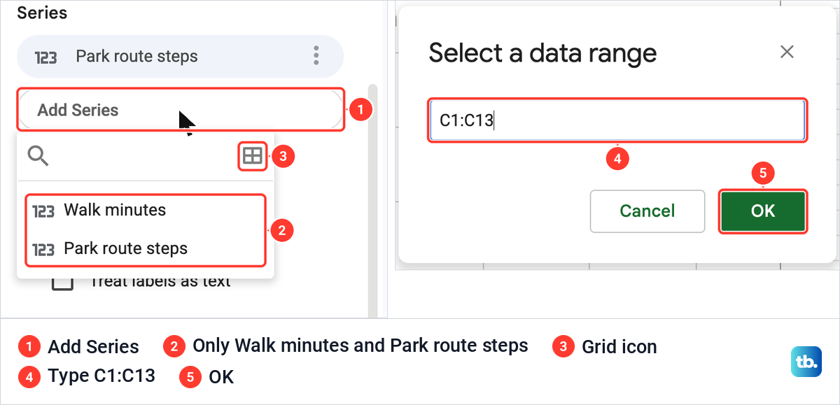
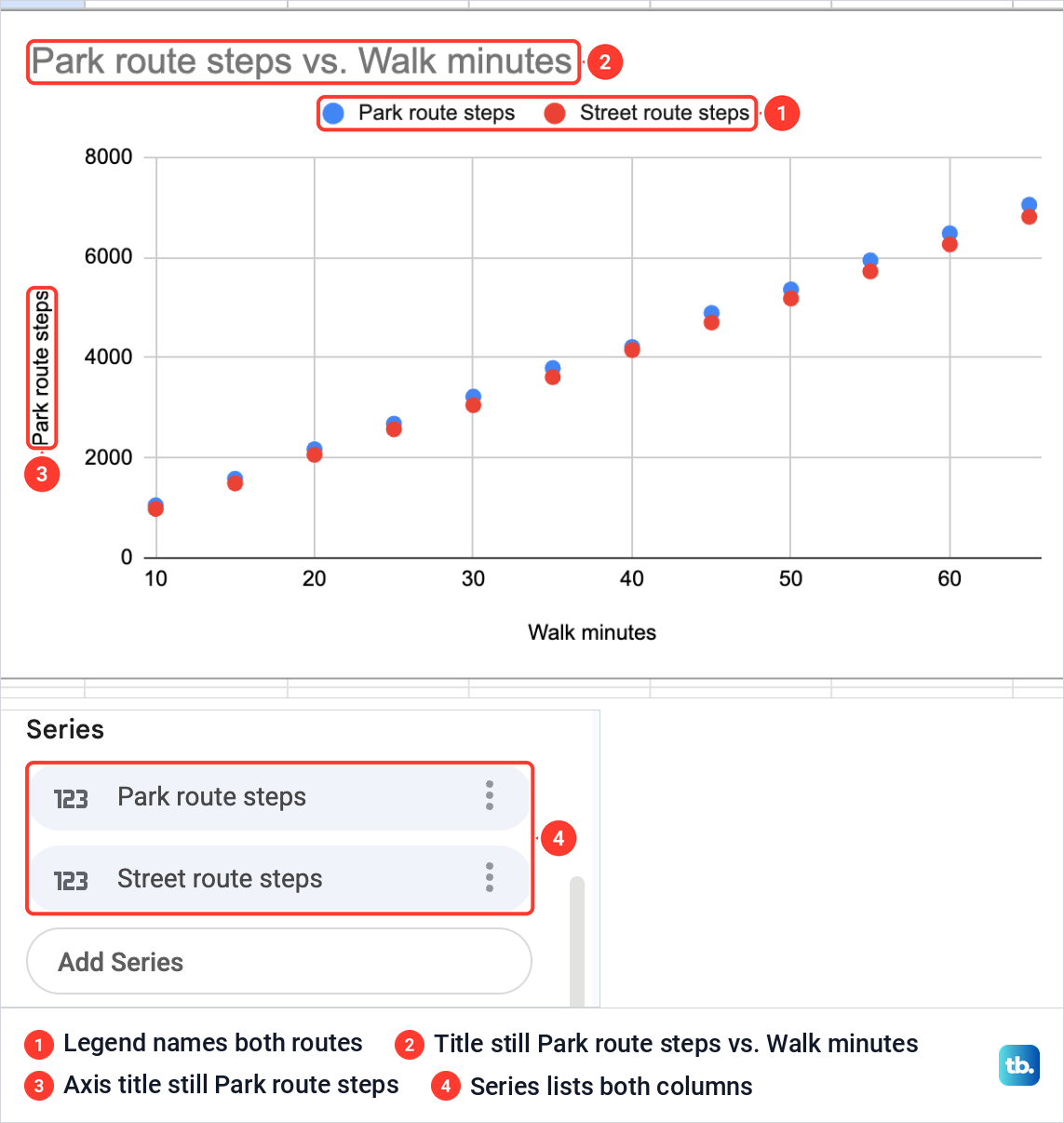
A second set of dots appeared in red, with a legend above the chart naming Park route steps and Street route steps, and Setup's Series list now held both. The street route sits a little lower at every walk length, a gap that is plain to see in the dots and easy to miss in two columns of numbers.
You can also widen the Data range, but check Series afterwards: when we did that on other charts in Sheets, the new column stayed off the chart until we picked it under Add Series. For a second set of points with X values of its own, the Add axis & series set button at the bottom of Setup adds a separate X and Y pair to the same scatter chart.
Name the chart and both axes
Adding the street route left the old names in place. The chart was still titled Park route steps vs. Walk minutes, and the vertical axis still read Park route steps, although it now showed both routes.
Open the Customize tab and then Chart & axis titles. The list at the top picks which title you are editing, such as Chart title or Vertical axis title, and the Title text box under it holds the words.
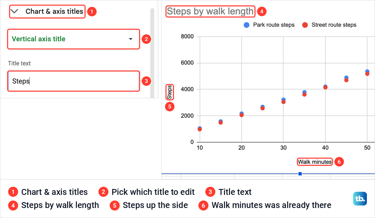
We typed Steps by walk length as the chart title, then chose Vertical axis title and typed Steps. The horizontal axis title already read Walk minutes, the same as the first column's heading, so it needed nothing.
Change the size and shape of the dots
Dot settings live in Customize > Series, and they apply to one set of dots at a time, so pick the series at the top of the section first. For a scatter chart the section holds Color, Fill color, Fill opacity, Point size, Point shape, Axis and Format data point.
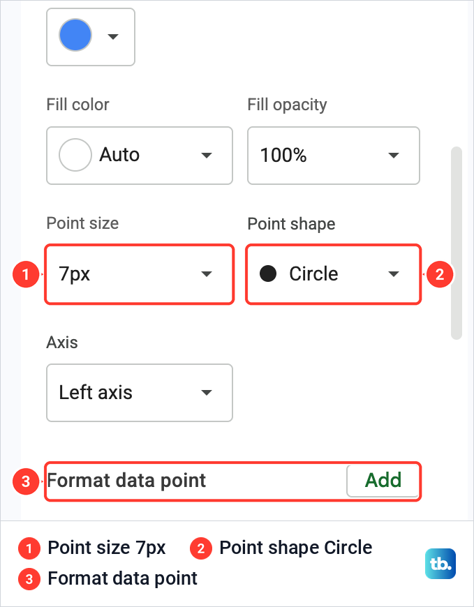
Ours opened at 7px and Circle, with Fill color on Auto and Fill opacity at 100%. A bigger point size helps a sparse chart, a smaller one helps when hundreds of dots overlap, and a different shape for each series keeps two sets apart when the chart is printed without color.
Lower in the same section are three more boxes: Error bars, Data labels and Trendline. Data labels prints each dot's value beside it, which suits a short list of dots.
Add a trendline to a scatter plot
A trendline shows the overall pattern in a set of dots without joining each dot to the next, which is a job for a line chart. With Type set to Linear, as ours was, it is one straight line, and the Type list also holds curved kinds such as Exponential and Polynomial. In Customize > Series, with the series you want chosen at the top, tick Trendline.
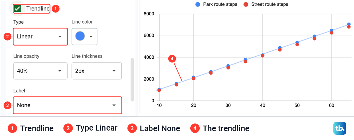
We ticked it for Park route steps, and a pale straight line ran through the blue dots. Its options appeared underneath: Type (Linear), Line color, Line opacity (40%), Line thickness (2px), Label (None) and Show R².
The line belongs to the series it was ticked for, so choose the other series at the top and tick Trendline again if you want one for each route. If Trendline is not in the list at all, trendlines do not work with that chart's data.
Show the trendline equation and R squared
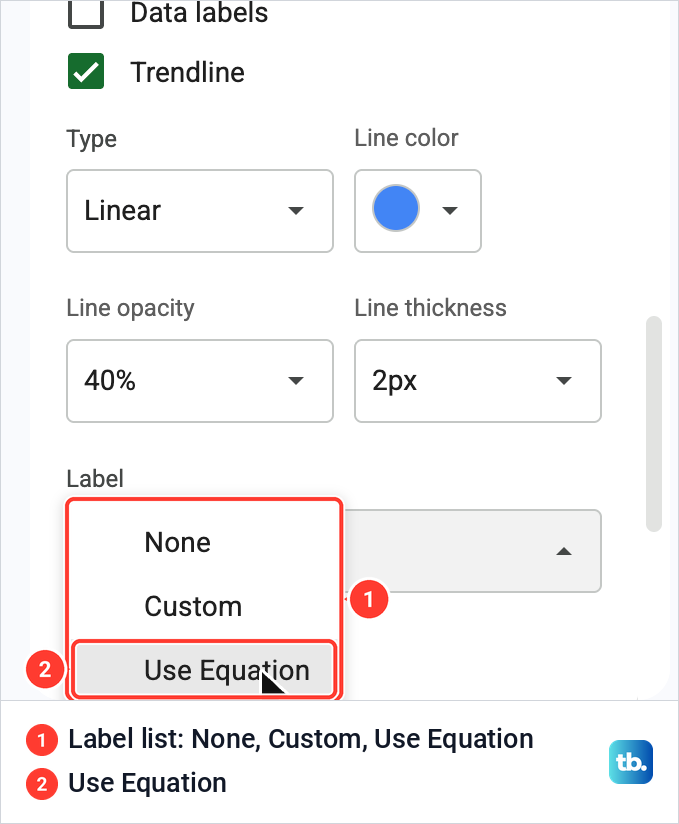
Open the Label list under the trendline options. It offers None, Custom and Use Equation, and Use Equation writes the line's formula into the chart's legend.
With Use Equation chosen, our legend gained an entry reading 109*x + -38.1. Ticking Show R² as well extended it to 109*x + -38.1 R² = 1, between the names of the two routes.
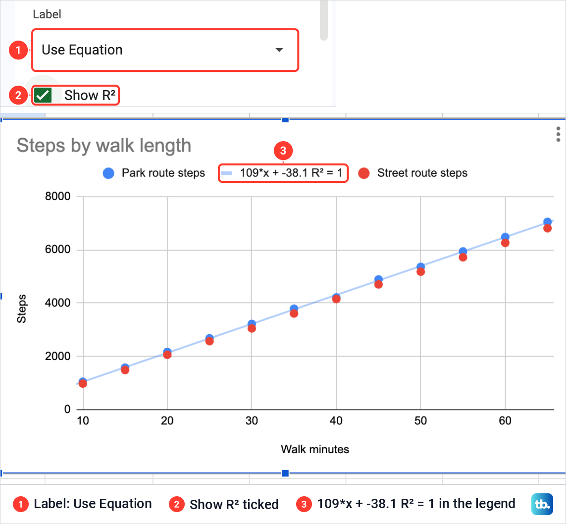
Read the equation as steps = 109 × minutes minus 38.1. The fitted line predicts about 109 more steps for each extra minute on the park route, so for a 30-minute walk it gives roughly 3,230 steps.
R² shows how closely the line fits the dots, and the closer it is to 1, the closer the fit. Our legend showed 1, but the legend rounds. Worked out from the same twelve rows, the slope is 108.6 and R² is 0.9996, so our dots lie very close to a straight line without sitting exactly on it.
Move the chart or download it
Drag the chart by an empty part of it to move it. We dragged ours to the right of the table, so the twelve walks and their dots sit side by side.
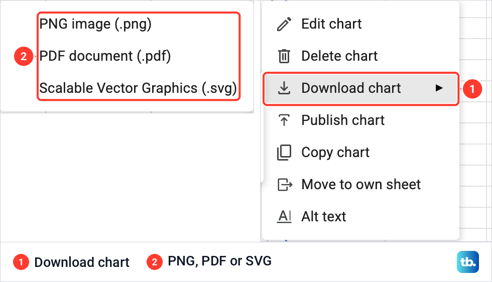
To save the chart as a file, click it, click the three dots at its top right and point to Download chart. The list offers PNG image (.png), PDF document (.pdf) and Scalable Vector Graphics (.svg). PNG suits a document or a message, and SVG stays sharp at any size.
Fix a scatter plot that looks wrong
You see bars, not dots. Sheets drew a column chart first for our two number columns. Open Setup, click Chart type and pick Scatter chart from the Scatter group.
Two columns gave one set of dots. The first column sets each dot's X position, so add another number column for a second set.
Add Series does not list your column. It lists only the columns inside the data range. Use the grid icon at the top of the list and type the column's range, as we did with C1:C13.
The title or an axis names only one series. Ours kept Park route steps vs. Walk minutes and a vertical axis of Park route steps after the second route was added. Retype both under Customize > Chart & axis titles.
The chart says Add a series to start visualizing your data. Look at Setup: X-axis should hold your X column, and Series at least one Y column. If Series is empty, click Add Series and choose one.
Start a chart in the Google Sheets app
The steps are the same on an Android phone or tablet and on an iPhone or iPad. Open the spreadsheet in the Google Sheets app, select the cells you want in the chart, then tap Insert and Chart. To change the chart type, tap Type, choose the scatter chart if the list offers it and tap Done. If it is not offered, change the type in Sheets on a computer.
To change a chart later, double-tap it, tap Edit chart and then Type. Trendlines and data labels on the points are added in Sheets on a computer, and charts are downloaded there too.
How we tested this guide
We tested this in Google Sheets on the web in Chrome on a Mac, plotting steps against walk minutes for 12 walks, adding a second series and a trendline with its equation.
Frequently Asked Questions
Why does my scatter plot show one set of dots when I selected two columns?
The first column of the range is the X axis, not a series. Each column after it becomes a set of dots, so two columns give one set and three columns give two.
How do I add another set of dots to a scatter plot?
Put the new Y values in a column of their own, sharing the same X column. In Setup, click Add Series, and if the column is not listed, use the grid icon at the top of the list to type its range.
Do the column headings become the axis titles?
The headings name the series in the legend. On our chart the horizontal axis title matched the first heading, but the vertical axis title named only the first series, so set both under Customize > Chart & axis titles.
Is a trendline the same as joining the dots?
No. A trendline is a fitted line that shows the overall pattern of the dots, straight for the Linear type, while a line that joins each point to the next is what a line chart draws.
How do I get the correlation between two columns?
Tick Show R² under the trendline to put R² in the legend, which shows how closely the line fits. For the correlation coefficient itself, type =CORREL(B2:B13, A2:A13) in an empty cell.
Can I make a scatter plot on my phone?
You can start one there. In the Google Sheets app, select the cells, tap Insert, then Chart, and choose the scatter chart under Type if the list offers it. If it does not, and for trendlines and data labels, use Sheets on a computer.