
To make a graph in Google Sheets, select the cells with your labels and numbers, including the header row, then click Insert > Chart. Sheets draws a chart straight away and opens the Chart editor, where you pick the chart type under Setup and change titles, colors and labels under Customize.
Google Sheets calls every graph a chart, so that is the word to look for in its menus. We built a line, a column and a pie chart from our household spending sheet, and two things surprised us: where the first chart landed, and what it took to get a missing line back.
The short version
- Select the data with its headers, then choose Insert > Chart.
- Pick a line, column or pie chart under Setup > Chart type.
- Titles, the legend and data labels are on the Customize tab.
- Line missing? Widening the Data range did not bring ours back, but Add Series did.
- The chart's three-dot menu holds Download chart (PNG, PDF or SVG) and Copy chart.
Set up your data before you make a graph
Sheets builds a chart from a block of cells, so lay the data out as a small table first. Put the labels, such as months, in the first column and each set of numbers in its own column beside them, with a short header on top. In a line or column chart the number headers become the legend names, and in a pie chart the labels in the first column name the slices.
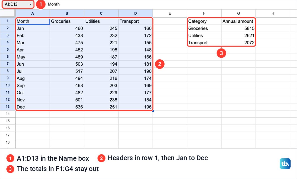
Our spending sheet holds Month, Groceries, Utilities and Transport in A1:D13, with Jan to Dec down the side. Next to it, F1:G4 holds a separate summary of each category's total for the year, which we used later for a pie chart.
Select the whole block, header row included. You can drag across it, or type the range into the Name box at the top left and press Enter, which is how we selected A1:D13. Leave totals and notes outside the selection, or a total row ends up plotted as one more month.
If your spending is stuck in a bank statement PDF, convert the PDF to Excel first, then open the workbook in Sheets and tidy it into this shape. One header row, one label column and plain numbers in the cells are all a chart needs.
Insert a chart in Google Sheets
With the cells selected, open the Insert menu and choose Chart. It sits in the middle of the menu, between Pre-built tables and Pivot table.

Sheets did not ask what kind of chart we wanted. It drew a line chart by itself, titled it Groceries, Utilities and Transport from our headers, put the legend on top and labelled the horizontal axis Month. It also dropped the chart straight on top of the table, covering columns B to H.
At the same time the Chart editor opened on the right, on its Setup tab. Setup showed Chart type set to Line chart, Data range A1:D13, Month under X-axis, an Aggregate box and our three columns under Series.
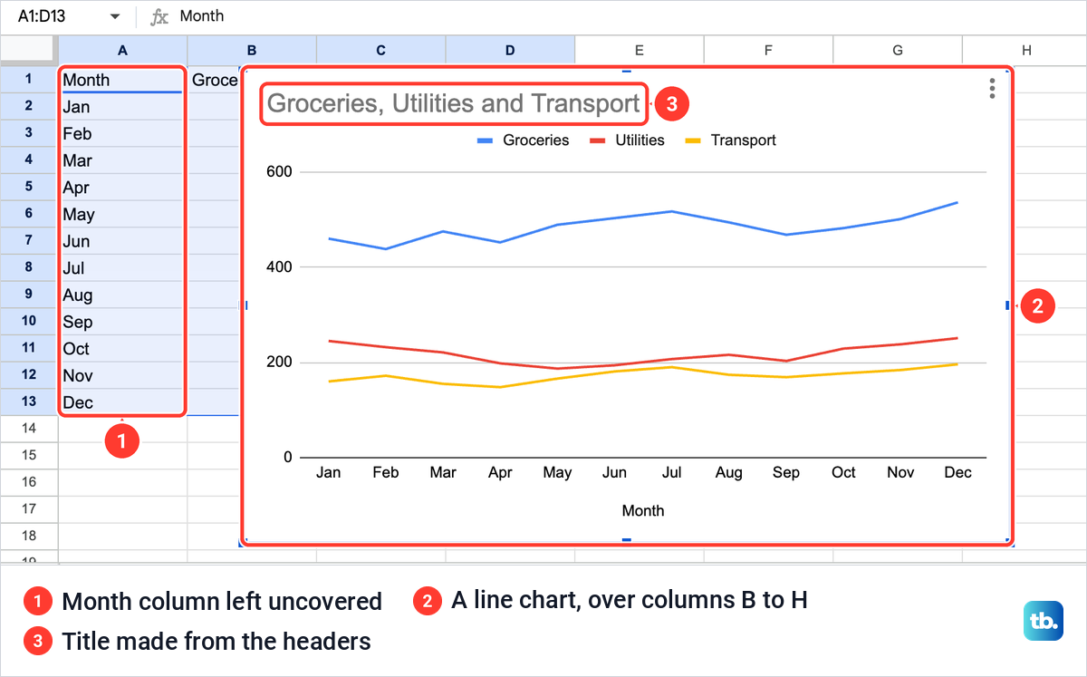
So the first job is getting the chart off your data. Click the chart once and blue handles appear on its edges and corners. We dragged the bottom right handle inward to shrink it, then dragged the chart by its body beside the table, into the columns to its right. The numbers in the table were untouched.
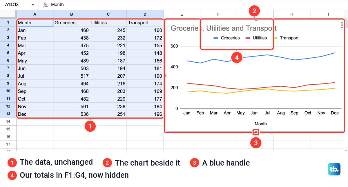
That spot was not empty, though. The chart now sat over our yearly totals in F1:G4 and hid them, so check what is under a chart before you leave it there.
If you close the Chart editor, double-click the chart to open it again. The three-dot menu at the chart's top right also has Edit chart, which does the same job.
Choose the right type of graph
The chart type should follow what the numbers mean, not how they look. Use this table to pick one, then set it under Setup > Chart type.
| What you want to show | Chart to pick | How to lay out the cells | On our spending sheet |
|---|---|---|---|
| A change over months, weeks or days | Line chart | Dates or periods in the first column, one number column per line | Month with Groceries, Utilities and Transport |
| Categories compared side by side | Column chart | Labels in the first column, one number column per series | The same twelve months as columns |
| A comparison with long category names | Bar chart | The same layout as a column chart | Works, but our short names suit columns |
| How one total splits into parts | Pie chart | One label column and one column of positive numbers | Category and Annual amount in F1:G4 |
| How one measured number moves with another | Scatter chart | Two columns of numbers, X first | Not a fit, because our first column is months |
Open the Chart type box to see every option. A Suggested group of four thumbnails built from your own data comes first, followed by groups for Line, Area, Column, Bar, Pie, Scatter, Map and Other.
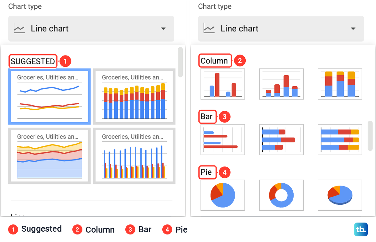
We switched our line chart to Column chart. Sheets drew three columns for each month, one per category, and Setup gained a Stacking box set to None by default. Change it if you want the three categories piled into one column per month.
A bar chart is the same idea turned on its side, which helps when category names are long. For our twelve months the line chart read best, because the eye can follow each category from January to December.
Add titles, a legend and data labels
Use the Customize tab of the Chart editor for titles, the legend, colors and data labels. For our line and column charts it was split into Chart style, Chart & axis titles, Series, Legend, Horizontal axis, Vertical axis and Gridlines and ticks. Click a section name to open it.
To print the numbers on the chart, open Series and tick Data labels. Ours came up with Type set to Value and Position set to Auto, and a number appeared above every column.
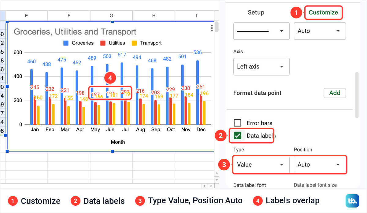
On a chart this busy, that is too much. With three categories across twelve months the labels crowded together and overlapped, so we unticked the box again. Data labels earn their place on a chart with a handful of bars, or on a single series.
Open Chart & axis titles and use the box at its top to choose which title you are editing. It lists Chart title, Chart subtitle, Horizontal axis title and Vertical axis title. Type in Title text below it, and the chart changes as you type.
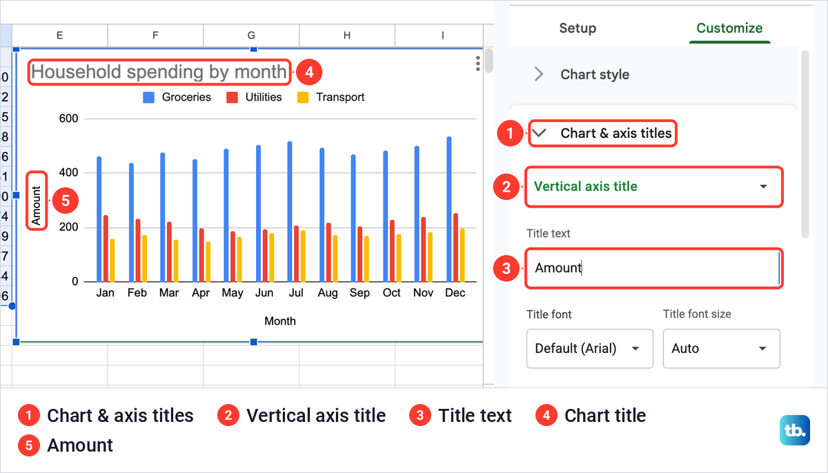
We replaced the automatic title with Household spending by month, then chose Vertical axis title and typed Amount. The horizontal axis already said Month, taken from the column header, so it needed nothing.
The legend has a section of its own. Legend > Position is set to Auto by default, and its list offers None, Top, Bottom, Left, Right, Inside, Labeled and Auto. When we later cut a chart down to one series, Sheets dropped the legend by itself.
Fix a graph with a missing line
A missing line can mean its column is outside the Data range, or that it is not listed under Series. We caused the problem on purpose to see how Sheets handles it, and the obvious fix did not work.
Click the grid icon at the right of Data range on the Setup tab. A Select a data range box opens with the current range, an Add another range button, Cancel and OK. We typed A1:B13, which leaves out Utilities and Transport, and clicked OK.
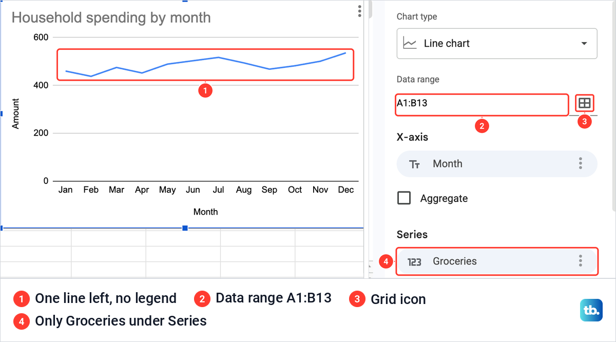
The chart dropped to a single Groceries line and the legend disappeared. Series listed Groceries and nothing else.
Then we put the range back. In the same box we clicked Add another range, entered A1:D13, removed the old A1:B13 row with its bin button and clicked OK. Data range read A1:D13 again, yet the chart still showed one line, and Series still listed only Groceries.
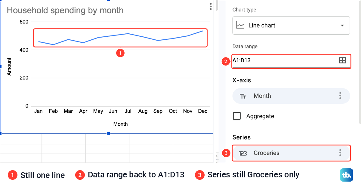
Widening the range tells Sheets which cells it may use, but it did not add those columns back as series. The button that does is Add Series, under the Series list. It opens a small picker with a search box and the columns in your range, here Groceries, Utilities and Transport.
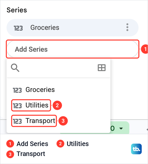
We picked Utilities, opened Add Series again and picked Transport. After we added both series, both lines and the legend were back.
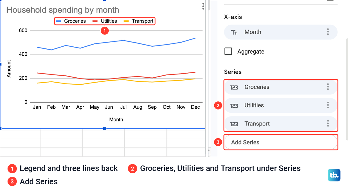
So if a line is missing, check Data range first, and if the column is already inside it, add the line with Add Series. If the wrong labels sit along the bottom, check that the label column comes first in the Data range and that Use column A as labels is ticked, as both were on our chart. The X-axis box's three dots offered only Remove and Add labels, so fix it in the range.
Swap rows and columns when the axis looks wrong
Sheets decides which way round to read your table. If the names you wanted in the legend end up along the bottom, or the other way round, scroll to the end of the Setup tab. Under Series and Add Series sit three boxes: Switch rows / columns, off by default, and Use row 1 as headers and Use column A as labels, which were both ticked for our table.
We tried it on the column chart version. Ticking Switch rows / columns moved Groceries, Utilities and Transport onto the horizontal axis and turned the twelve months into the series, with a legend at the right that ended in 2 more. The other two boxes changed their wording to Use column A as headers and Use row 1 as labels.
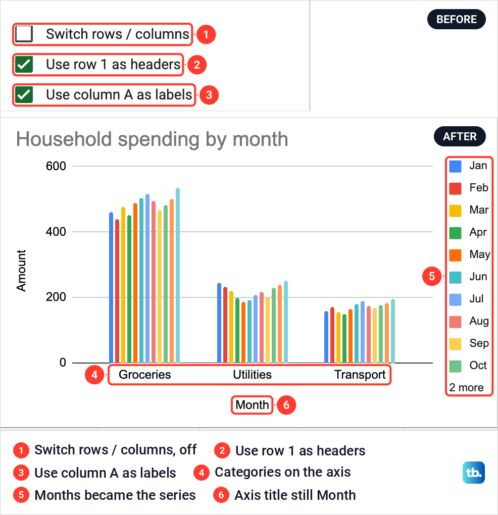
One thing did not follow. The horizontal axis title still said Month although the axis now showed categories, so retype it under Customize if you keep the switched layout. We unticked the box to go back, because months along the bottom suit this data.
Make a pie chart from category totals
A pie shows how one total splits into parts, so it needs one label column and one column of positive numbers. Twelve months of three categories is the wrong shape for that, which is why our sheet has the summary in F1:G4.
The totals in G2:G4 are plain SUM formulas, such as =SUM(B2:B13) for Groceries, and they came to 5815, 2621 and 2072. If your figures are still in an Excel workbook, you can sum a column in Excel first and bring the totals across.
We reused the existing chart. In the Select a data range box we changed the range to F1:G4, and Series became Annual amount with Category on the X-axis. Then we chose Pie chart from the Pie group under Chart type and retitled it Annual spending by category.
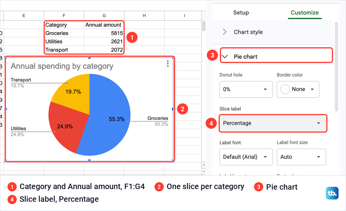
For a pie, Customize swaps its sections for Chart style, Pie chart, Pie slice, Chart & axis titles and Legend. The Slice label box under Pie chart offers None, Label, Value, Percentage and Value and Percentage. Percentage gave us 55.3%, 24.9% and 19.7%, which is 5815, 2621 and 2072 out of 10508.
If a slice seems to be missing, check its number. A value of zero or below does not show up in a pie chart, so a category with no spending has no slice.
Download, copy or publish your chart
Every chart has a three-dot menu at its top right. Ours listed Edit chart, Delete chart, Download chart, Publish chart, Copy chart, Move to own sheet and Alt text.
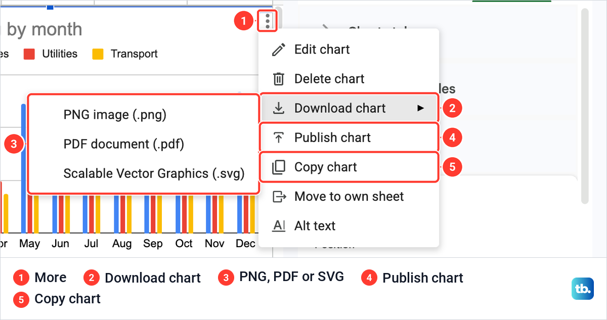
Download chart opens a short list: PNG image (.png), PDF document (.pdf) and Scalable Vector Graphics (.svg). Pick PNG for a picture to drop into an email or chat, SVG for an image that stays sharp at any size, and PDF for printing.
If all you need is a quick picture of what is on screen, a screenshot does the job. Here is how to take a screenshot on Windows, and how to take a screenshot on a Mac.
Move to own sheet puts the chart on a sheet of its own, away from the cells. Publish chart puts a chart on the web. Choose Link for an address you can share, or Embed for HTML to paste into a website or blog, then click Publish.
To use the chart in a document, choose Copy chart, open the Google Doc and press Ctrl + V, or Command + V on a Mac. When we pasted into a new document, a Paste chart box asked whether to Link to spreadsheet or Paste unlinked.
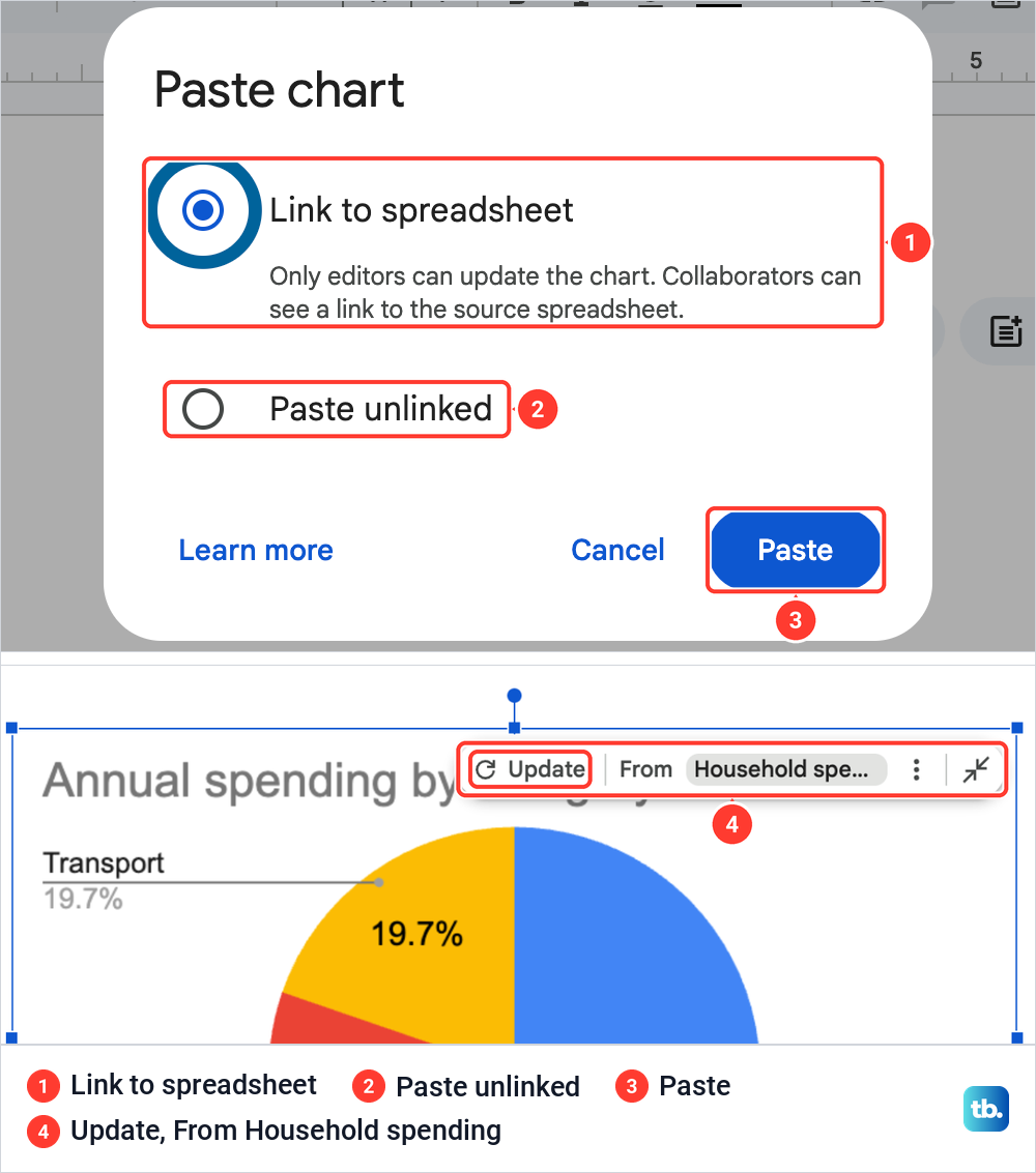
Link to spreadsheet was already selected, with a note that only editors can update the chart and collaborators can see a link to the source spreadsheet. We kept it and clicked Paste. Selecting the pasted chart then showed a small bar with Update and From Household spending, the button to use after the numbers change in Sheets.
Paste unlinked gives you a copy that stays as it is. If the pasted chart sits too close to the edge of the page, change the margins in Google Docs to give it room.
Make a graph in the Google Sheets app on Android
Open the spreadsheet in the Google Sheets app and select the cells you want in the chart. Tap Insert, the plus button, then Chart. To pick a different type, tap Type and choose one, then tap Done.
To change a chart later, double-tap it and tap Edit chart. The options there are Type, Legend, Titles and Color, which cover the chart type, where the legend sits, the chart and axis titles and the colors of the lines, bars, dots or slices. To move a chart, tap it and drag it, and use the blue markers to resize it.
Data labels are the exception. Labels and notes on a chart are added in Sheets on a computer, so add those in a browser. To share a quick picture of the finished chart, take a screenshot on Android.
Make a graph on an iPhone or iPad
The iPhone and iPad app uses the same route. Open the spreadsheet in the Google Sheets app, select the cells, tap Insert, the plus button, and then Chart. Tap Type if you want a different chart, and Done when you are finished.
Double-tap an existing chart and tap Edit chart to reach Type, Legend, Titles and Color, then finish with Done. Data labels again need Sheets on a computer. To send just the chart as an image, take a screenshot on iPhone, then crop it to the chart before you send it.
How we tested this guide
We tested this in Google Sheets on the web in Chrome on a Mac, building a line, a column and a pie chart from our household spending sheet.
Frequently Asked Questions
How do I make a graph from two columns in Google Sheets?
Select both columns with their headers, labels first and numbers second, then choose Insert > Chart. Sheets picks a type for you, and you can change it under Setup > Chart type in the Chart editor.
How do I put two lines on one graph?
Put the dates or labels in the first column and each set of numbers in its own column beside them, then select all of it and insert a line chart. Each number column becomes its own line, and its header becomes the name in the legend.
Why is a line missing from my graph?
Its column can be outside the chart's Data range, or missing from the Series list. Widen the range under Setup, and if the line still does not appear, click Add Series and choose the column. On our sheet, widening the range alone did not bring the line back.
How do I put months on the horizontal axis?
Keep the months in the first column of the range and leave Use column A as labels ticked at the bottom of Setup. If the months turn up in the legend instead, untick Switch rows / columns.
How do I show numbers on a graph in Google Sheets?
On a computer, open Customize > Series and tick Data labels. For a pie chart, open Customize > Pie chart and choose an option under Slice label, such as Percentage.
Why is a slice missing from my pie chart?
A value of zero or a negative number does not get a slice. Check the numbers in the value column, and check that the Data range covers every category.
Can I save a Google Sheets graph as a picture?
Yes. Click the chart's three-dot menu, choose Download chart and pick PNG image. PDF and SVG are on the same list.