

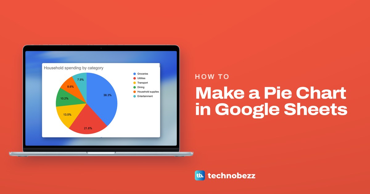
To make a pie chart in Google Sheets, select a column of category names and the column of amounts beside it, then click Insert > Chart. Sheets may draw a different chart first, so open Chart type in the Chart editor and pick Pie chart. If a category sits on several rows, tick Aggregate on the Setup tab to turn those rows into one slice.
We built a pie in Chrome from our spending sheet, a list of 12 purchases in six categories. Sheets drew a column chart before we asked for the pie, and the first pie had twelve slices because every category sat on two rows. Both are quick to fix, and the same panel holds the percentages, the legend, a pulled-out slice and the donut hole.
The short version
- Make it: select the category and amount columns with their headings, then choose Insert > Chart.
- Pick the pie: in the Chart editor, open Chart type and choose Pie chart in the Pie group.
- One slice per category: tick Aggregate on the Setup tab when a name repeats on several rows.
- Show percentages: choose Customize > Pie chart > Slice label > Percentage.
- Missing slice: a category whose amounts are all zero gets no slice and no legend entry.
- Save it as a picture: use the chart's three-dot menu, then Download chart.
Pie chart settings at a glance
| What you want | Where it is | What it did in our chart |
|---|---|---|
| Make the chart | Insert > Chart, with both columns selected | Drew a column chart titled Amount vs. Category |
| Switch to a pie | Setup > Chart type > Pie chart | Twelve slices, one for each row |
| One slice per category | Setup > Aggregate | Six slices, with Sum beside Amount |
| Percentages on the slices | Customize > Pie chart > Slice label | 38.3% printed on the Groceries slice |
| A title of your own | Customize > Chart & axis titles | Household spending by category |
| Legend as a tidy list | Customize > Legend > Position | Right put the six names beside the pie |
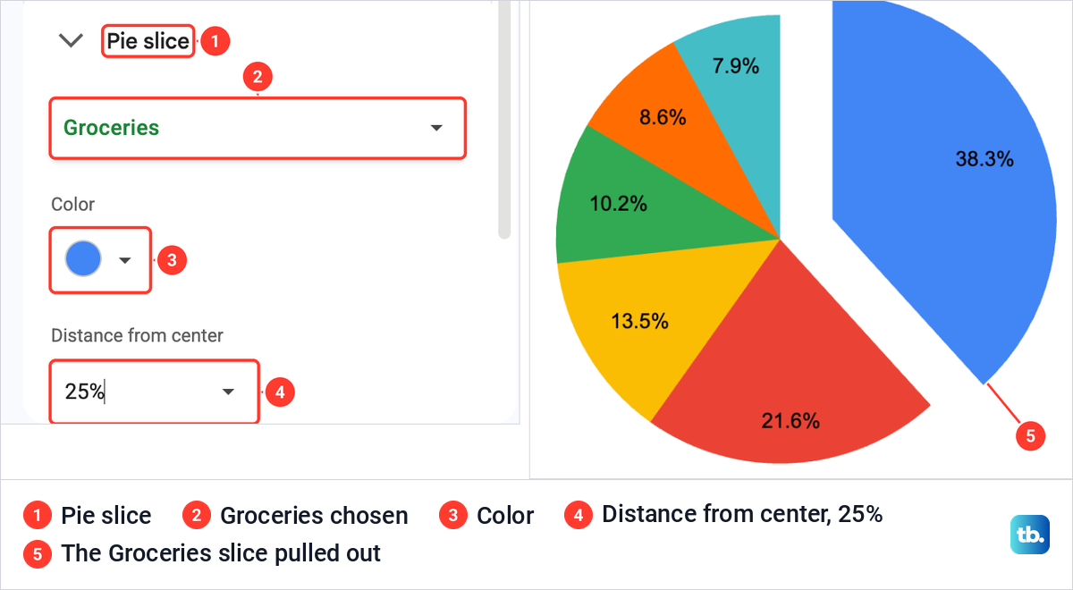
| Pull one slice out | Customize > Pie slice > Distance from center | 25% moved Groceries away from the rest |
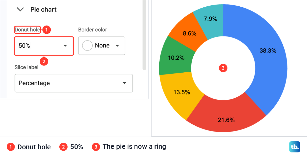
| A donut chart | Customize > Pie chart > Donut hole | 50% turned the pie into a ring |
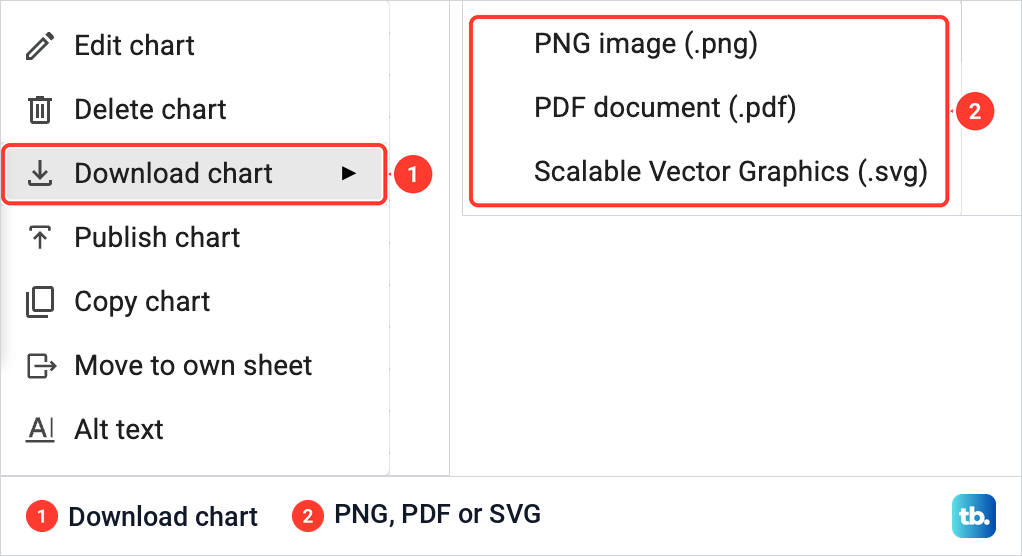
| A picture of the chart | Three-dot menu > Download chart | Offered PNG, PDF and SVG |
For column, line and other chart types, our guide to making a graph in Google Sheets covers the choices. A pie is the right pick when the numbers are parts of one whole, such as a month of spending split by category.
Set up the data for a pie chart
A pie chart needs two columns: one with a label for each slice and one with positive numbers. Put the labels on the left and the amounts on the right, with a heading at the top of each. If your list has amounts but no categories yet, add a column next to the amounts and type a category on each row.
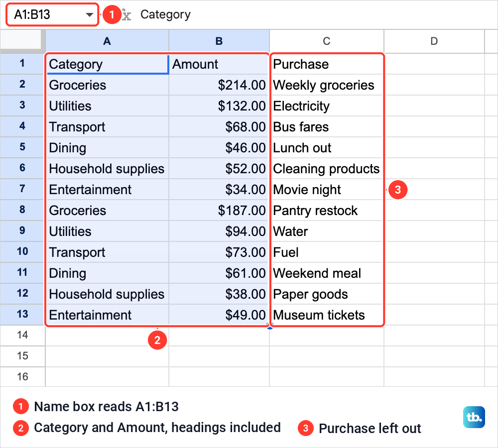
Our file, Household spending, has a tab named Spending with three headings in row 1: Category, Amount and Purchase. Below them are twelve purchases, two in each of six categories, such as Groceries at $214.00 for Weekly groceries and $187.00 for Pantry restock. The Purchase column only describes each amount, so it stays out of the chart.
Drag from the Category heading down to the last amount, so both headings are part of the selection. We selected A1 to B13, and the Name box at the left of the formula bar read A1:B13, with column C left out.
Aggregate, further down, adds together the rows that carry the same category name. If you type the names by hand, a list of set choices keeps every row spelled the same way, and our guide to creating a drop-down list in Google Sheets shows how to set one up.
On a long list, it also helps to freeze the heading row while you check the rows. Category and Amount then stay in view as you scroll down.
How to make a pie chart in Google Sheets
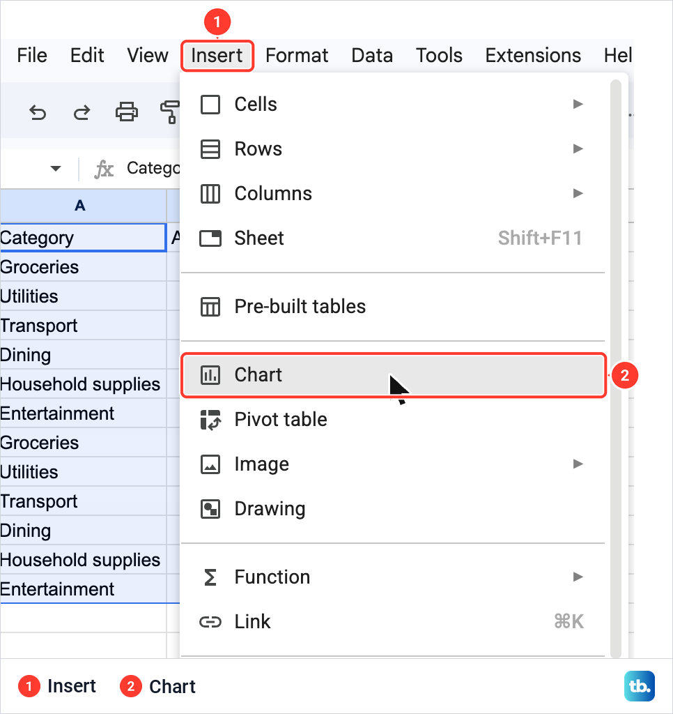
With the two columns selected, open the Insert menu at the top and choose Chart. Sheets places a chart on the sheet and opens the Chart editor in a panel on the right, on its Setup tab.
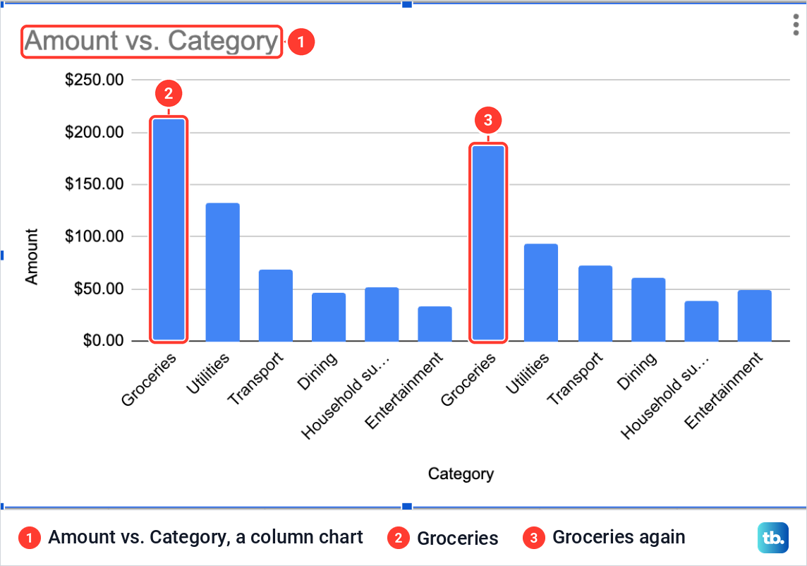
Our first chart was not a pie. Sheets drew a column chart titled Amount vs. Category, with twelve bars and every category name on the axis twice. That is the chart Sheets picked for this data, so expect to choose the pie yourself.
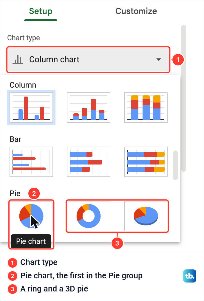
In the Chart editor, click the Chart type box, which read Column chart, and scroll the list down to the Pie group. It has three thumbnails. Pointing at the first one showed the name Pie chart, and that is the one to click. If you close the panel at any point, double-click the chart to open the Chart editor again.
Combine repeated categories into one slice
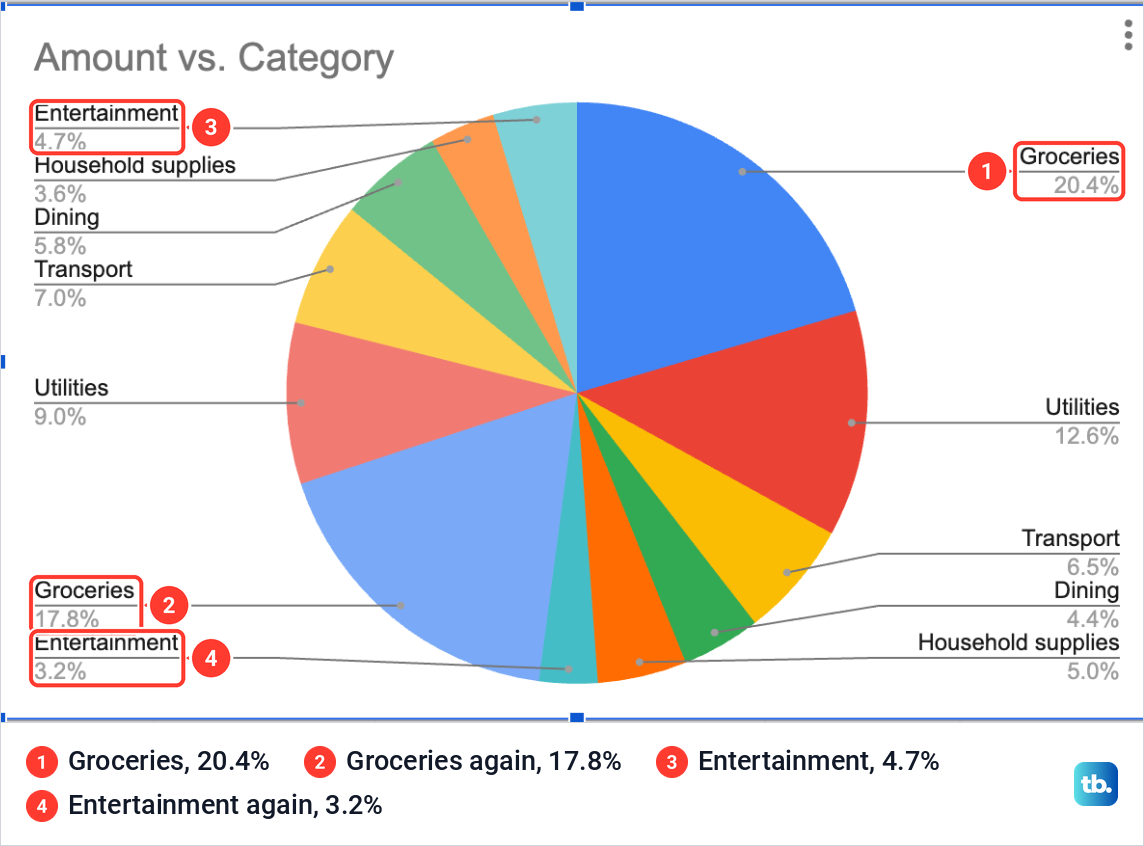
A pie gives each row of data its own slice. Our list has each category twice, so the first pie had twelve slices: Groceries appeared at 20.4% and again at 17.8%, and Entertainment at 4.7% and 3.2%. The chart was right about twelve purchases, but it did not show where the money went.
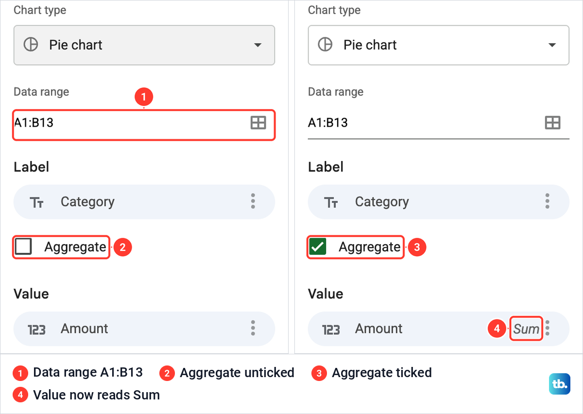
The fix is one box on the Setup tab. Under the Data range, which read A1:B13, Setup for a pie lists Label with Category in it, an Aggregate box and Value with Amount in it. Aggregate was unticked at first.
When we ticked Aggregate, Sheets added up the rows that share a category name, and the Value chip changed to Amount with Sum beside it. No formula, helper table or extra column was needed.
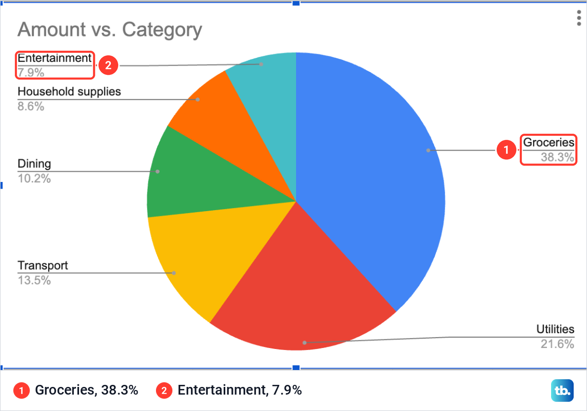
The pie dropped to six slices: Groceries 38.3%, Utilities 21.6%, Transport 13.5%, Dining 10.2%, Household supplies 8.6% and Entertainment 7.9%. Those are the category totals of $401, $226, $141, $107, $90 and $83 out of $1,048, so the purchase list can stay exactly as you typed it.
Aggregate adds every row with the same name, including a purchase typed twice by mistake. If that may have happened, check the rows before you remove duplicates in Google Sheets. That tool keeps one row of each set that matches in the columns you compare, so compare every column, including a date if your list has one, or a real purchase made twice goes too.
Sorting does not combine anything on its own. But sorting the whole list by its Category column puts each category's rows next to each other, which makes them easier to check.
Show percentages on the slices
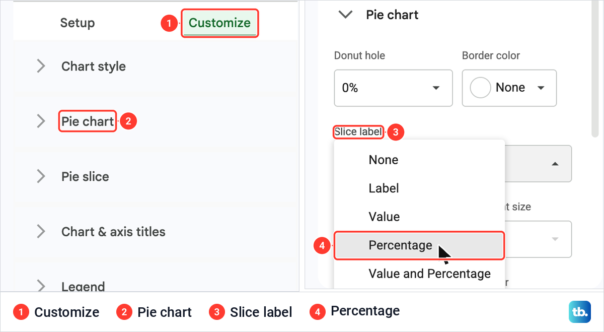
You do not need a column of percentages. The pie works out each share of the whole by itself, and one setting prints it on the slices. In the Chart editor, open the Customize tab, which lists Chart style, Pie chart, Pie slice, Chart & axis titles and Legend for a pie.
Open Pie chart. It holds Donut hole, which read 0%, Border color and Slice label, which read None by default. The Slice label list offers None, Label, Value, Percentage, and Value and Percentage, so choose Percentage.
Each slice then carried its share, such as 38.3% on Groceries. The names and shares that Sheets had drawn beside the pie stayed there too, so every share showed twice, and the title still read Amount vs. Category. The next section tidies both.
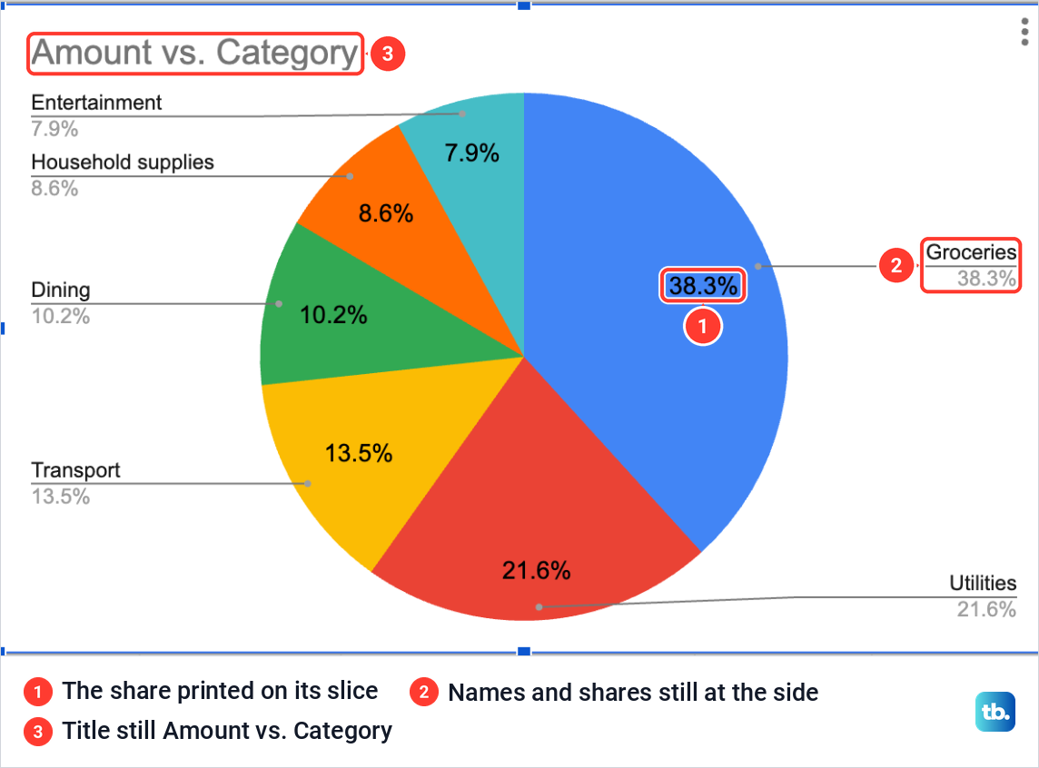
The shares come from the total of the amounts in the chart's data range. Ours covered all 12 amount cells, B2:B13, so that total was $1,048, the same figure you get when you total a column in Google Sheets. Once a slice label is chosen, the Label font and Label font size boxes under it become available.
The list has no choice that puts the name and the percentage together on a slice. Keep Percentage on the slices and set the legend to Right for the names, or leave it on Auto to see each name and share beside its slice.
Change the chart title and legend
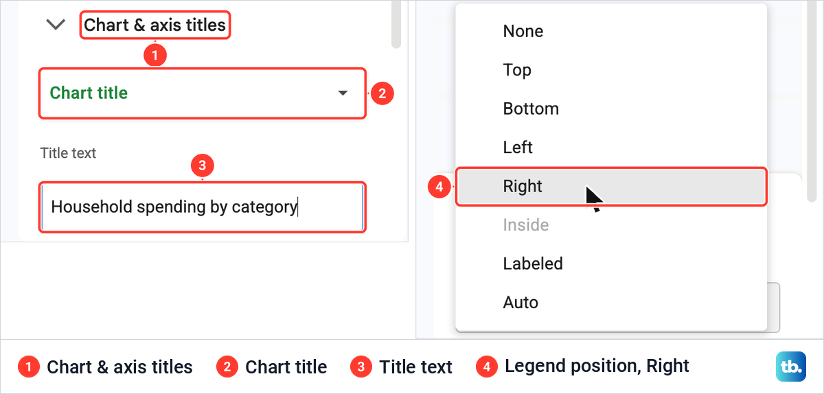
Sheets names the chart after its columns, Amount vs. Category in our case. To change it, open Customize > Chart & axis titles, leave the first box on Chart title and type in the Title text box. We typed Household spending by category, and the chart took the new title.
The legend has its own section further down. Its Position list offers None, Top, Bottom, Left, Right, Inside, Labeled and Auto, with Inside grayed out for our pie. It stood on Auto, which drew each name beside the pie with a line to its slice.
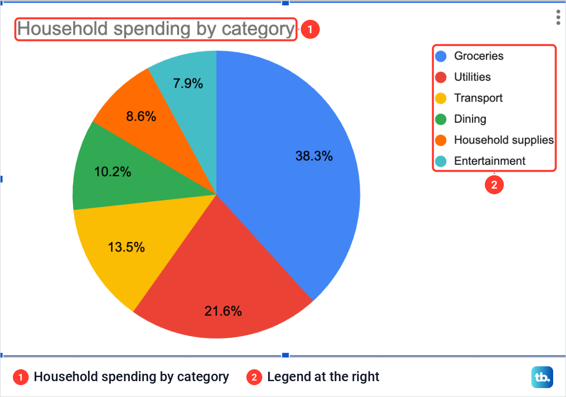
We chose Right. The six names moved into a plain list at the right of the pie, each with its color dot, while the percentages stayed on the slices. With percentages on the slices, this read more cleanly than Auto, because each share now appears only once.
Pull one slice out of the pie
To make one category stand out, open Customize > Pie slice and choose the slice in the list at the top. The section has a Color control for that slice and a Distance from center box with 0%, 25%, 50%, 75% and 100%.
We chose Groceries and 25%, and the Groceries slice moved away from the rest of the pie with its 38.3% label. Typing 0% in the same box put it back. To give the chosen slice a color of its own, use the Color control in the same section.
Turn the pie into a donut chart
A donut chart is the same pie with a hole in the middle, and Sheets spells the setting Donut hole. Open Customize > Pie chart and pick a size in the Donut hole box: 0%, 25%, 50% or 75%.
At 50%, our pie became a ring, with the percentages still on each slice and the legend unchanged. Setting the box back to 0% returned the plain pie.
Why a slice is missing from the pie
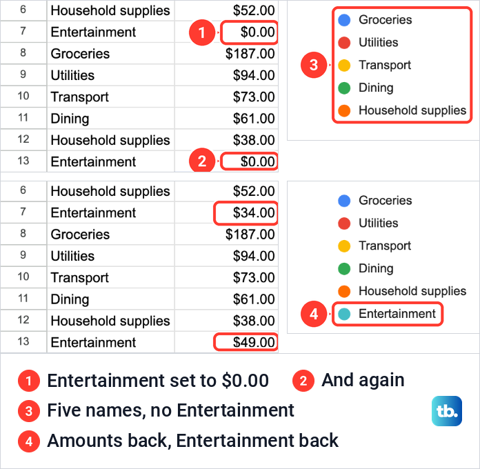
A category whose amounts are zero gets no slice. We set both Entertainment amounts, in B7 and B13, to 0, and the Entertainment slice disappeared along with its name in the legend. The pie redrew itself at once, and the other five shares were worked out again from the smaller total, so Groceries went from 38.3% to 41.6%.
Pressing Command + Z twice on our Mac undid the two edits and brought back 34, 49, the sixth slice and its legend entry. On Windows and ChromeOS, undo is Ctrl + Z.
A category whose total is negative is left out in the same way. If a slice is missing and its total is above zero, double-click the chart and look at the Data range on the Setup tab, which has to take in every row of the list. Click the grid icon at the end of that box to select the cells again.
Move, download or reuse the pie chart
A new chart lands on top of the cells. To move it, click an empty part of the chart and drag it; we placed ours to the right of the table, over columns D to J. Drag the blue markers on the edges of a selected chart to resize it.
Every chart has a three-dot button at its top right. Its menu lists Edit chart, Delete chart, Download chart, Publish chart, Copy chart, Move to own sheet and Alt text. Download chart offers PNG image (.png), PDF document (.pdf) and Scalable Vector Graphics (.svg).
A PNG suits a slide, an email or a message, and an SVG stays sharp at any size. To put the pie in a Google Doc or a Slides presentation instead, open it and choose Insert > Chart > From Sheets, then pick the spreadsheet and the chart.
The chart stays linked to the spreadsheet unless you untick Link to spreadsheet when you add it. Anyone who can open the document can see a linked chart, even without access to the spreadsheet itself.
Make a pie chart in the Google Sheets app
The Google Sheets app for Android, iPhone and iPad makes a pie the same way, with fewer settings. Open the spreadsheet, select the category and amount cells, then tap the plus button, Insert, and then Chart. If the app does not draw a pie, tap Type and choose one, then tap Done.
To change the chart later, double-tap it and tap Edit chart. The app offers Type, Legend, Titles and Color, where Color changes the colors of the slices. Slice labels and Aggregate are not among them, so set up percentages and combined categories in Sheets on a computer. To move the chart, tap it and drag it, and use the blue markers around it to resize it.
How we tested this guide
We tested this in Google Sheets on the web in Chrome on a Mac, turning 12 purchases in six categories into a pie chart and setting its labels, legend, title and donut hole.
Frequently Asked Questions
How do I make a pie chart with percentages in Google Sheets?
Make the pie, then double-click it and open Customize > Pie chart. Set Slice label to Percentage, and each slice shows its share of the total, such as 38.3% for Groceries in our spending sheet.
Do I need to work out the percentages first?
No. Chart the amounts themselves, and Sheets works out each share from the total of the amounts in the chart. The Percentage slice label then prints those shares on the slices.
Why does the same category show up as more than one slice?
Each row of data becomes a slice, so a category on two rows gets two slices. Double-click the chart, open Setup and tick Aggregate, and Sheets adds the rows with the same name into one slice.
Why is one of my categories missing from the pie?
Its total is zero or negative, or its rows sit outside the chart's Data range. In our sheet, setting both Entertainment amounts to 0 removed its slice and its name in the legend.
Why did Google Sheets make a column chart instead of a pie?
Insert > Chart picks a chart type for you, and for our category and amount columns it picked a column chart. Open Chart type in the Chart editor and choose Pie chart in the Pie group.
How do I save a pie chart as a picture?
Click the chart, click the three dots at its top right and choose Download chart, then PNG image (.png). PDF and SVG are in the same list.
Can I make a donut chart in Google Sheets?
Yes. Open Customize > Pie chart and set Donut hole to 25%, 50% or 75%, and at 50% our pie became a ring with the percentages still on the slices.