
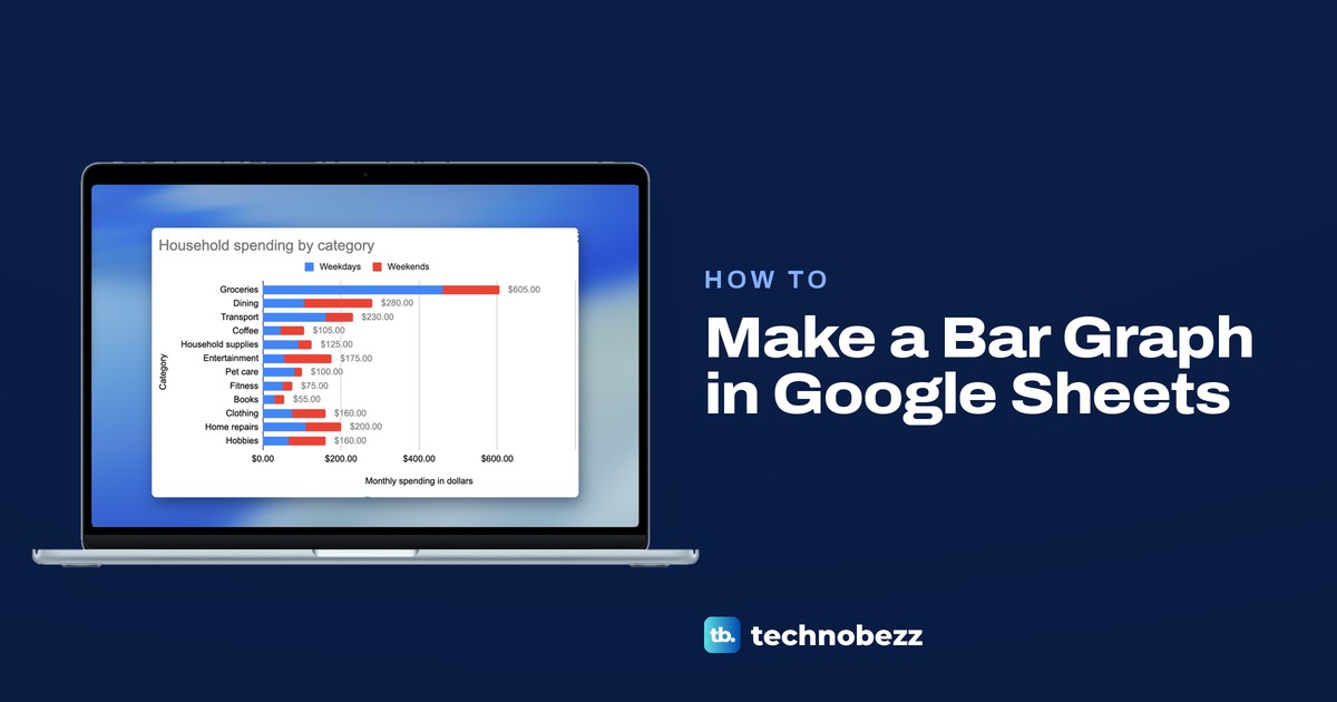
To make a bar graph in Google Sheets, select your category names and numbers together with their headings, choose Insert > Chart, then open Chart type in the Chart editor and pick Bar chart. In our sheet, Sheets drew a column chart with upright bars first, so that last step is the one that turns the bars on their side.
We built a bar graph from a 12-row household spending sheet in Chrome, then compared two columns, stacked them, labeled the totals and sorted the bars. Two things caught us out: widening the data range did not add the second column to the chart, and the chart kept its old title after we added that column.
The short version
- Make the chart: select the names and numbers with their headings, then choose Insert > Chart.
- Turn the bars sideways: in Setup, open Chart type and pick Bar chart from the Bar group.
- Compare two columns: widen the Data range, and if the second column is not under Series, click Add Series and pick it.
- Stack them: set Stacking to Standard for totals, or to 100% for shares.
- Show stacked totals: in Customize > Series, choose Apply to all series and tick Total data labels. With one series, tick Data labels instead.
- Undo a wrong click: press Command + Z on a Mac, or Ctrl + Z on Windows and ChromeOS.
Bar graph types at a glance
| What you want to show | What to set in the Chart editor | What the chart looks like |
|---|---|---|
| One number for each category | Chart type: Bar chart, Stacking: None | One horizontal bar per category |
| Two numbers side by side | Bar chart, with the second column under Series (Add Series if it is missing) | Two bars per category in two colors, with a legend |
| Two parts that add up to a total | Stacking: Standard, which renames the type Stacked bar chart | One bar per category in two segments, as long as the total |
| Each part as a share of its category | Stacking: 100%, which renames the type 100% stacked bar chart | Every bar the same length, split by share |
| Upright bars instead | Chart type: Column chart | The same data in vertical columns |
Set up your data for a bar graph
For a bar graph, put the category names in one column and the numbers beside them, with a heading over each column in row 1. Sheets puts the names from the first column down the side of a bar chart and uses each number column's heading as the series name in the legend. Each row is one category: with one number column it gets one bar, and with two it gets two bars side by side or one stacked bar.
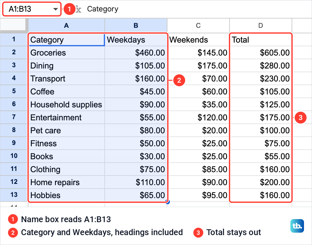
Our sheet, Household spending, lists twelve categories in column A, with weekday spending in column B and weekend spending in column C. Column D holds a Total for each row, =SUM(B2:C2) filled down, which stays out of the chart and is used to sort it later. For a column like that, our guide to adding columns in Google Sheets shows how to put one in.
Keep each category to one row, since each row is one category in the chart. If rows were copied into the list twice, remove duplicates in Google Sheets before you chart it, and a drop-down list in Google Sheets keeps the category names in a growing list consistent.
Now click the first heading, hold Shift and click the last number you want in the chart. We selected A1:B13, the categories and the Weekdays column with both headings, and the Name box at the top left read A1:B13. On a list longer than the screen, freeze a row in Google Sheets so the headings stay in view as you scroll down to the last row.
How to make a bar graph in Google Sheets
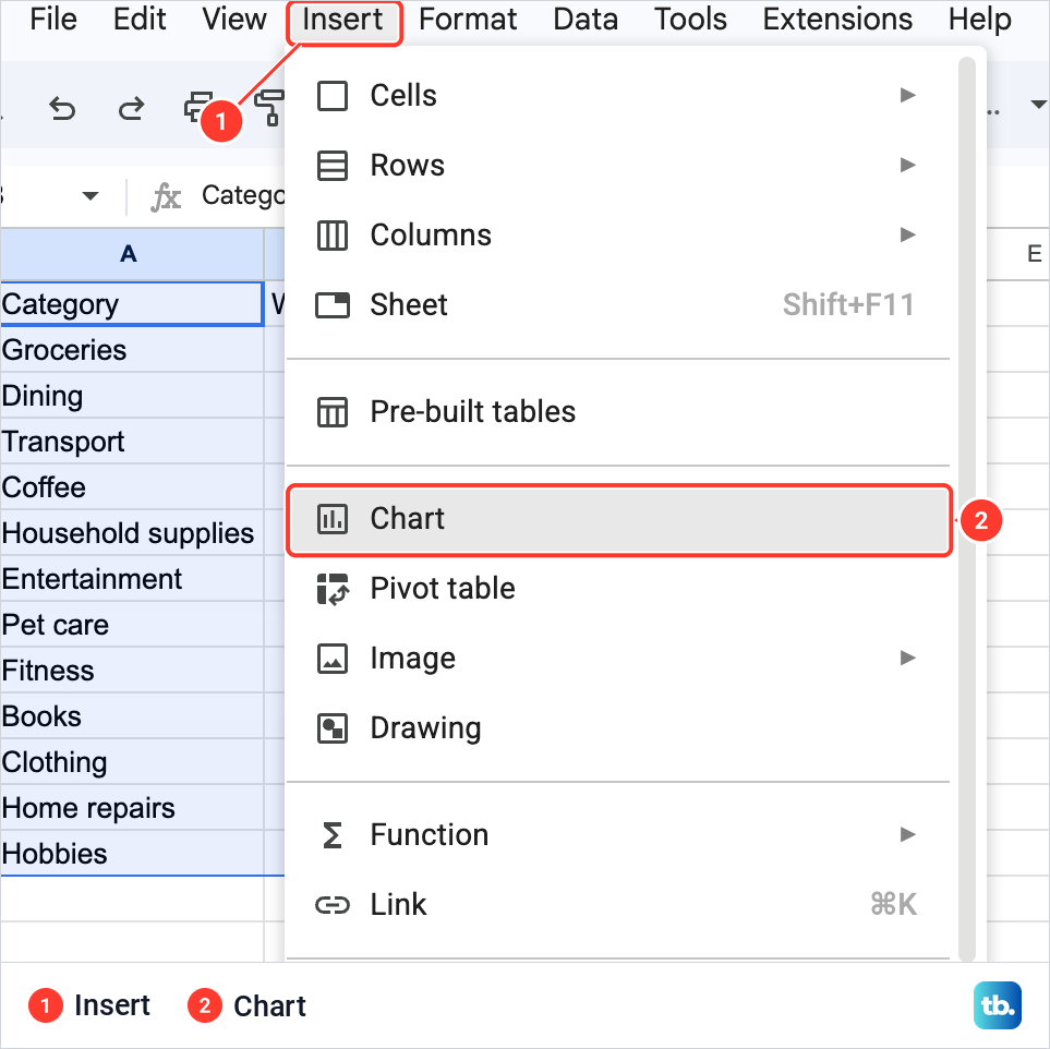
With the range selected, open the Insert menu and choose Chart. It sits under Pre-built tables, just above Pivot table.
Sheets put a chart on the sheet at once and opened the Chart editor on the right, with a Setup tab and a Customize tab. The chart it drew was a column chart with upright bars, titled Weekdays vs. Category. Setup confirmed it: Chart type read Column chart and Data range read A1:B13.
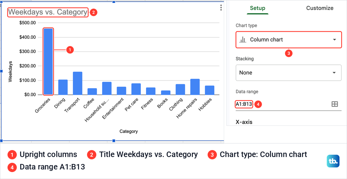
Sheets picks that first type by itself, and for our columns it was not a bar chart. It also squeezed the longest name: the slanted label under the fifth column read Household su... instead of Household supplies.
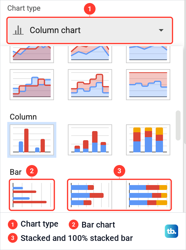
To change it, click the Chart type box. The list opens on four Suggested charts, followed by groups headed Line, Combo, Area, Column, Bar and more. Scroll down to Bar, where the first of three thumbnails is Bar chart and the other two are its stacked and 100% stacked versions.
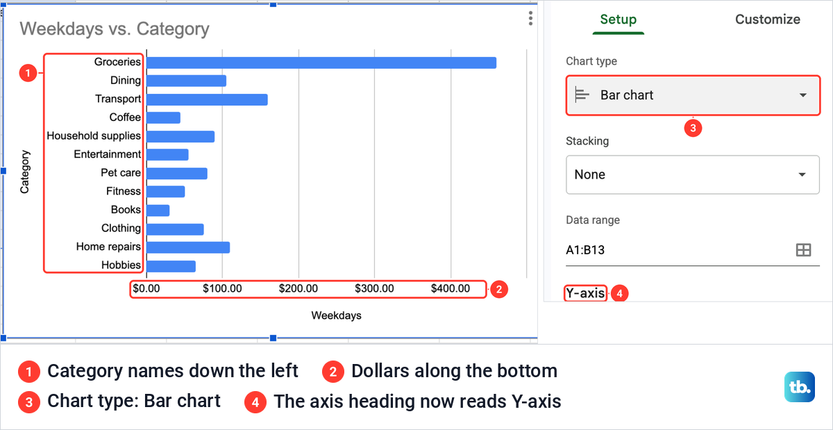
Click Bar chart, and the bars turn on their side: one horizontal bar per category, the names down the left and the dollar amounts along the bottom. Every name fits in full now, Household supplies included. In Setup, Chart type reads Bar chart, and the axis heading under the data range changes from X-axis to Y-axis, with Category under it.
That is a finished bar graph. For a pie, see our guide to making a pie chart in Google Sheets, and for line and other kinds of chart, our guide to making a graph in Google Sheets.
Bar chart or column chart
A Bar chart in Google Sheets has horizontal bars with the categories down the side, and a Column chart has vertical bars with the categories along the bottom. Both sit in the same Chart type list, so you can switch at any time without touching the data.
Horizontal bars suit long category names and long lists. Columns suit a short list or anything read from left to right, such as the months of a year.
One box in Setup looks as if it should swap the two, but it does something else. Lower in Setup sit Switch rows / columns, Use row 1 as headers and Use column A as labels, with the last two ticked for our range. When we ticked Switch rows / columns, the chart became a single group of twelve differently colored bars labeled Weekdays, with the twelve categories moved into a legend.
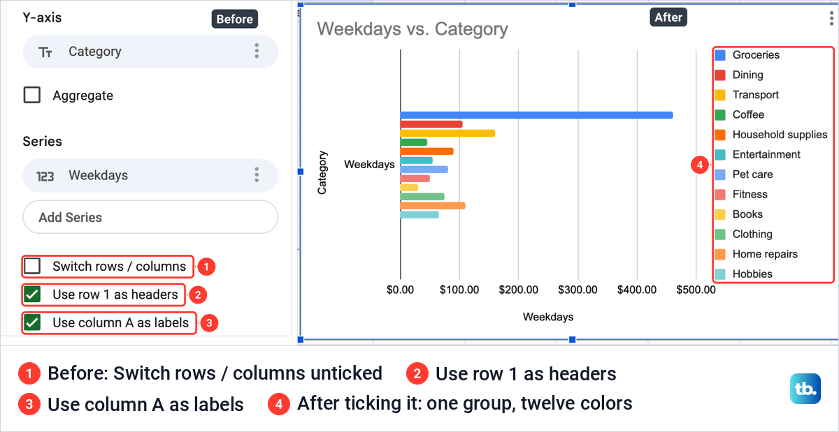
So Switch rows / columns changes which cells Sheets treats as categories and which as series, not the direction of the bars. We pressed Command + Z to put it back, which is Ctrl + Z on Windows and ChromeOS. Leave both header boxes ticked when your headings sit in row 1 and your names in column A.
Compare two columns in one bar graph
To show weekday and weekend spending side by side, the chart needs both number columns. Click the grid icon at the right of the Data range box to open Select a data range, type the wider range and click OK. We typed A1:C13. To add numbers from columns that are not next to each other, click Add another range in the same box and select the second block.
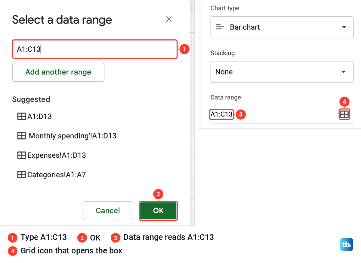
The Data range changed to A1:C13, but the chart still showed only the Weekdays bars. The new column was inside the range and still not in the chart, so adding it took one more step.
Scroll down Setup to Series. Ours listed only Weekdays, so we clicked Add Series. The list offered Weekdays and Weekends, and choosing Weekends gave every category a second, red bar under its blue one, with a legend for the two colors above the bars.
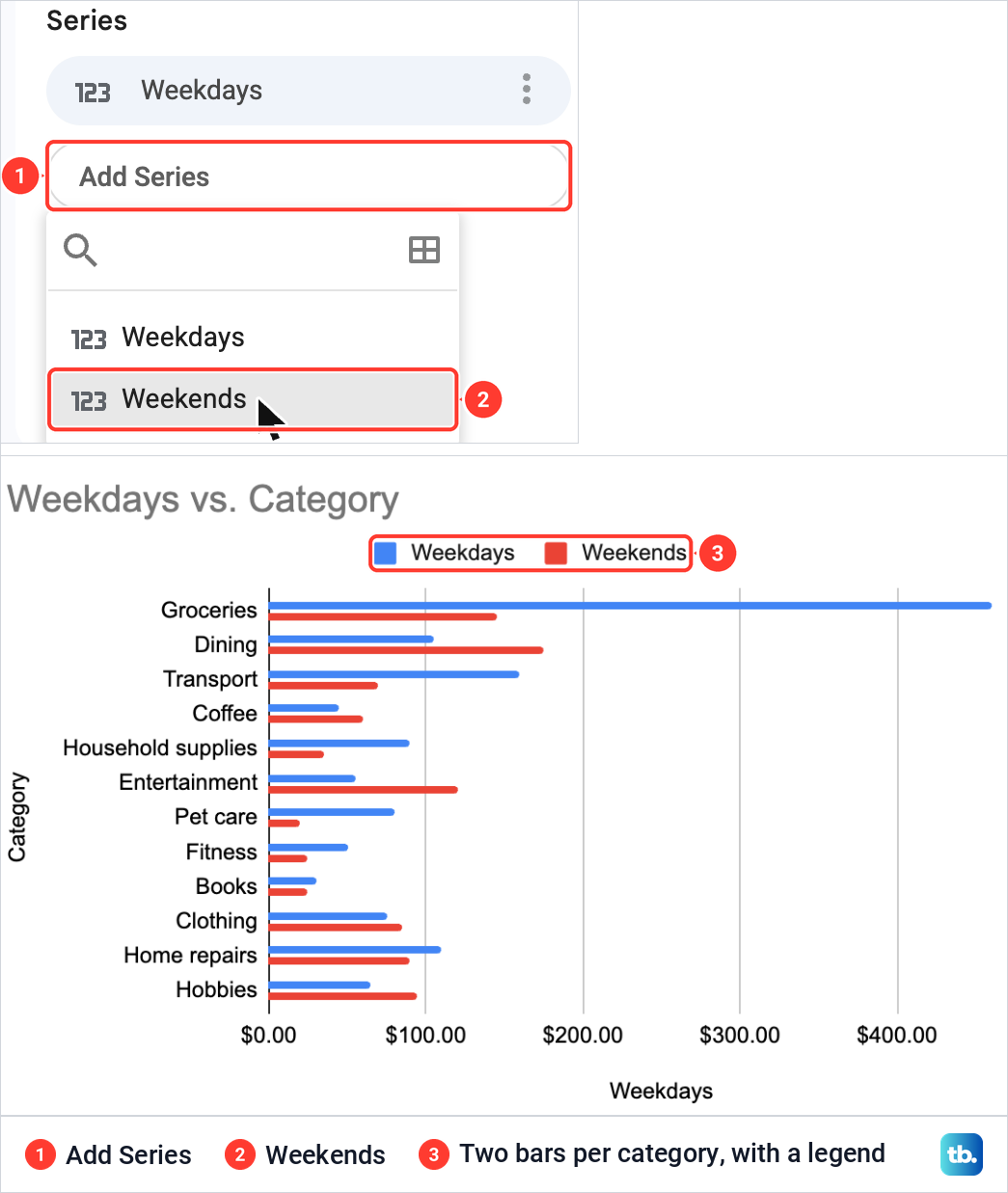
This is a grouped bar chart, with two bars per category measured from zero. Ours showed at a glance that Dining and Entertainment cost far more at weekends, while Groceries and Transport cost more on weekdays.
The chart kept its old title, Weekdays vs. Category, and the bottom axis still read Weekdays, although both columns were now in it. The section on titles below fixes both.
Make a stacked bar chart
Stack the bars when the parts add up to something real. Our weekday and weekend amounts add up to each category's monthly total, so one bar in two segments shows the split and the total at once. A stacked chart needs at least two series, so add the second column first.
In Setup, open Stacking, which offers None, Standard and 100%, and choose Standard. The two bars of each category joined into one bar of two segments, and Groceries reached just past 600 dollars, its total of $605.00. The Chart type box changed by itself to Stacked bar chart.
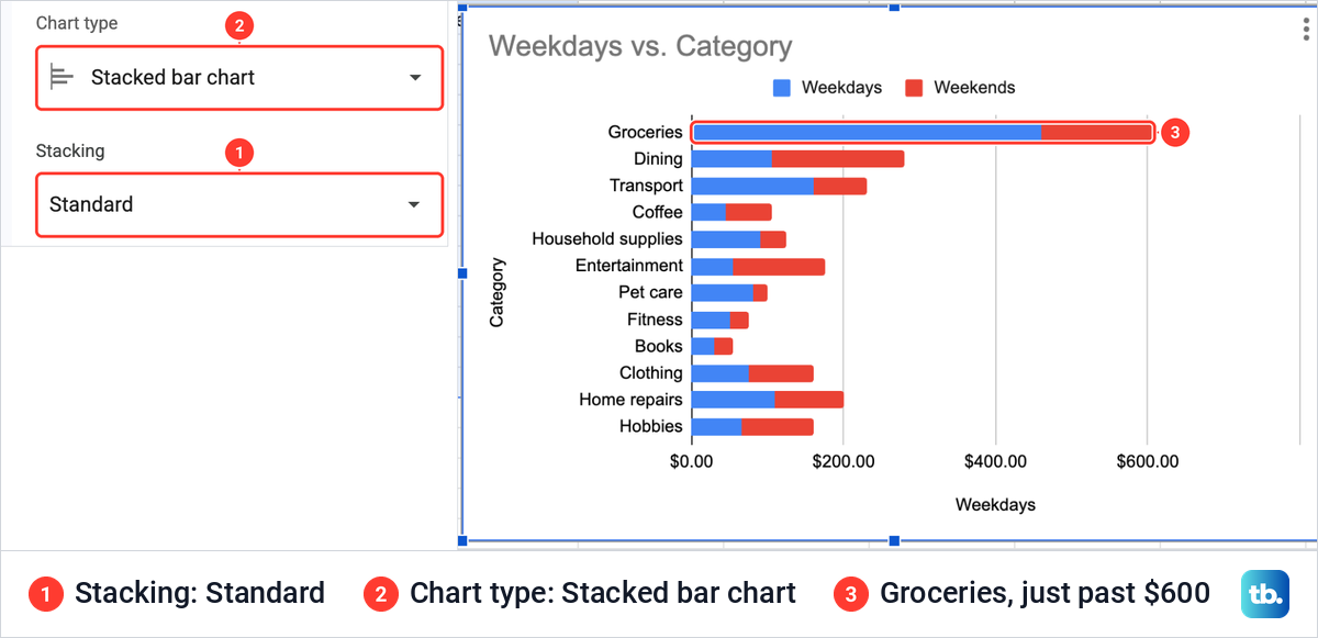
The second thumbnail in the Bar group, Stacked bar chart, is another way to the same chart. Only stack numbers that really add up: a budget stacked on top of what you spent makes a bar whose length means nothing.
Show each part as a share with 100% stacked bars
Choose 100% in the Stacking list when the split matters more than the amount. Every bar became the same length, the bottom axis ran from 0% to 100%, and each bar was divided by share. Chart type then read 100% stacked bar chart.
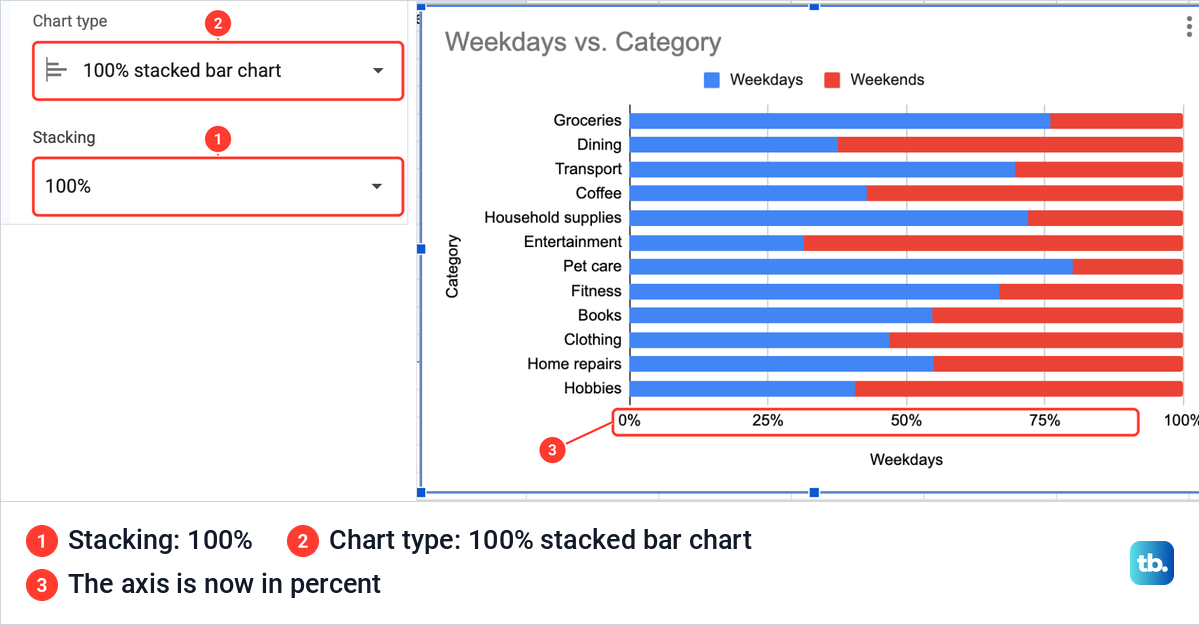
Read this view for proportions only. Pet care and Groceries were mostly weekday spending and Entertainment and Dining mostly weekend spending, but the bars no longer show that Groceries cost nearly six times as much as Coffee. We set Stacking back to Standard for the rest of this guide.
Add a chart title and axis titles
Click Customize at the top of the Chart editor. Its sections include Chart style, Chart & axis titles, Series, Legend, Horizontal axis and Vertical axis.
Open Chart & axis titles. The list at the top picks which title you are editing: Chart title, Chart subtitle, Horizontal axis title or Vertical axis title. Choose one, then type in the Title text box under it.
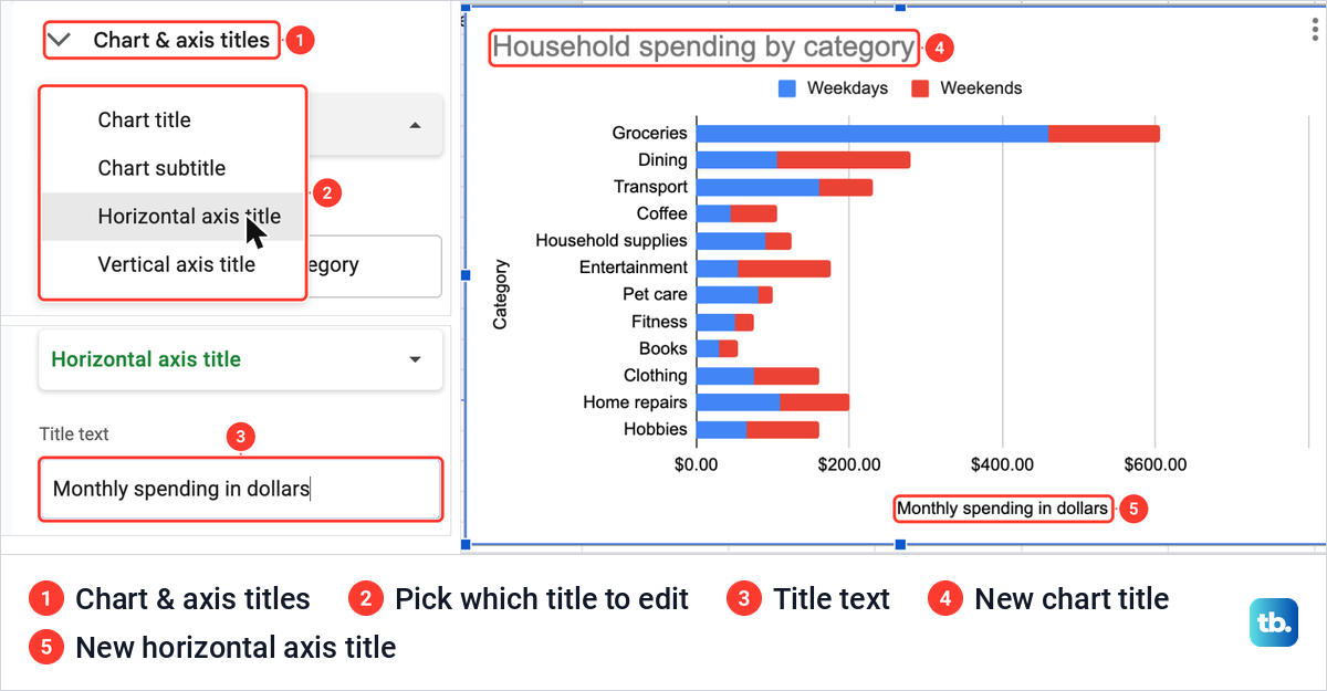
We typed Household spending by category as the chart title, then chose Horizontal axis title and typed Monthly spending in dollars. The chart changed as we typed. On a bar chart the horizontal axis carries the amounts, so that is the title to use for your units.
Show the totals on the bars
In Customize, open Series. A chooser at the top picks which series to change: Apply to all series, Weekdays or Weekends. Lower down is Data labels.
On a stacked chart, the obvious box gives a poor result. With the chooser on Weekdays, Data labels printed the weekday amounts only, and they landed on top of the red segments, where they were hard to read. With Apply to all series chosen and Data labels ticked, every bar carried two amounts and the labels crowded each other.
The box to use is Total data labels, which we found only with Apply to all series chosen. On its own it printed one total at the end of each bar: $605.00 for Groceries, $280.00 for Dining, $230.00 for Transport and so on, the same figures as our Total column. We kept it and turned Data labels off.
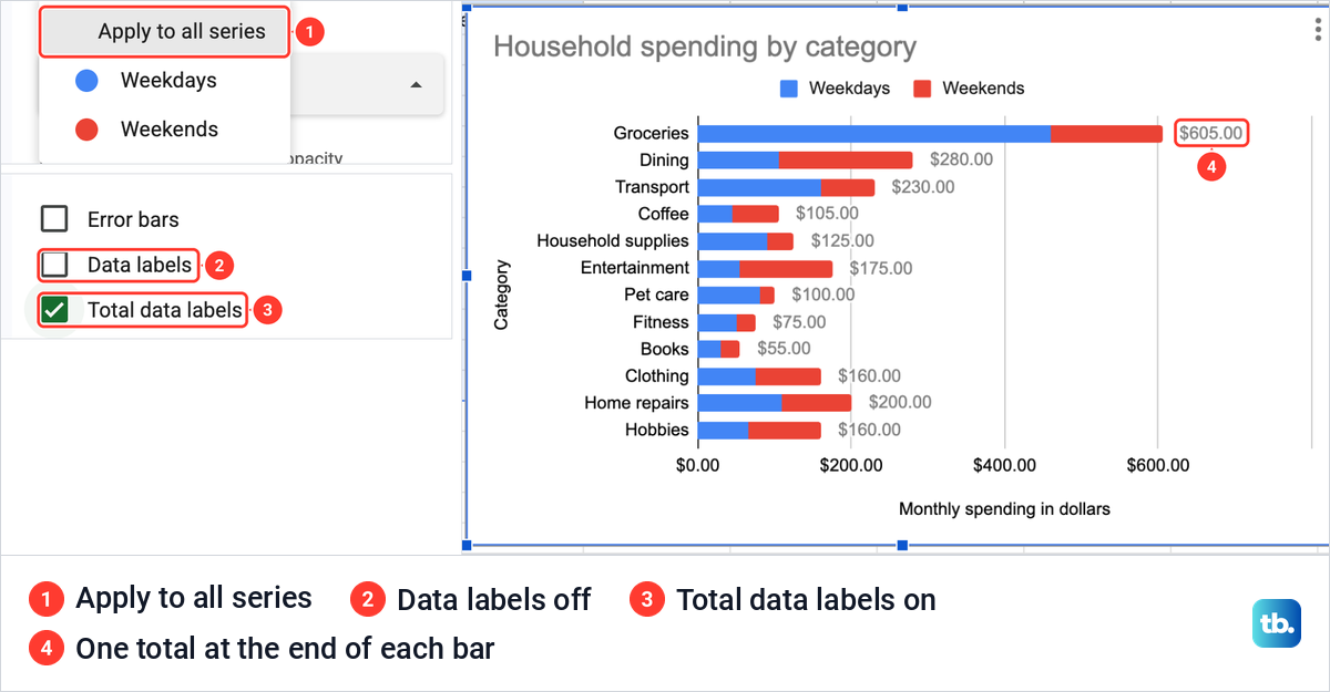
Total data labels adds up the stacked parts, so it belongs on a stacked chart. With one series, plain Data labels gives one value per bar.
Sort the bars from largest to smallest
A bar chart follows the order of its rows, so sorting the table sorts the chart. Select the whole table, here A1:D13, including the Total column even though it is not in the chart, so every row moves as one.
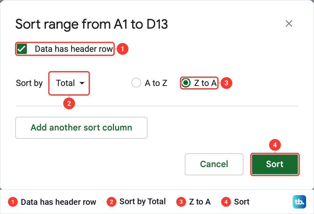
Then choose Data > Sort range > Advanced range sorting options. In the box, tick Data has header row so the headings stay in row 1, set Sort by to Total, choose Z to A and click Sort. The same dialog is covered in our guide to alphabetizing in Google Sheets.
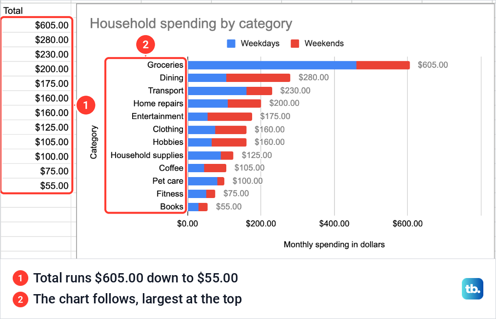
Our table then ran from Groceries at $605.00 down to Books at $55.00, and the chart redrew in the same order, with the largest category at the top and the smallest at the bottom. A to Z gives the reverse order.
Move, resize or download the chart
Drag the chart by an empty part of it to move it. We moved ours to the right of the table so both stay in view. A selected chart shows eight blue handles around its edge, and dragging one resizes it.
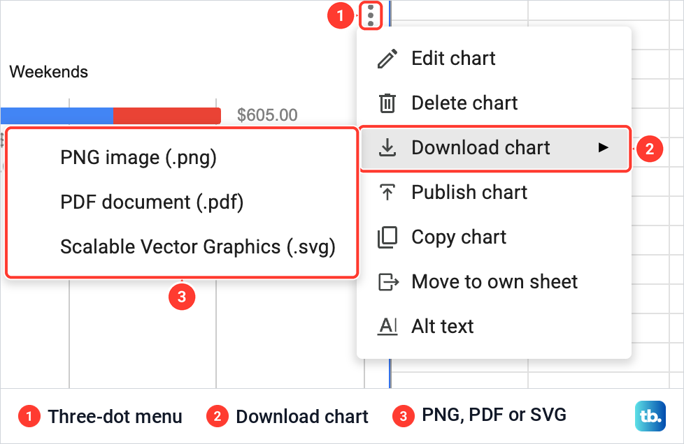
To save the chart as a file, click it, then click the three dots at its top right. The menu holds Edit chart, Delete chart, Download chart, Publish chart, Copy chart, Move to own sheet and Alt text. Download chart offers PNG image (.png), PDF document (.pdf) and Scalable Vector Graphics (.svg).
In Google Docs or Slides, Insert > Chart > From Sheets brings the chart into the file, and unticking Link to spreadsheet gives a copy that is not linked to the sheet. People with access to a document or presentation can view every linked chart in it, even if they cannot open the spreadsheet behind it, and a chart published to the web with Publish chart lets people see the data used to create it.
Fix a bar graph that looks wrong
The bars are upright, or long names are cut short. Sheets drew a column chart, as it did for us, and its slanted labels cut Household supplies short. Open Setup, click Chart type and pick Bar chart from the Bar group, which showed every name in full.
The second column is missing. If it still does not appear after you widen the Data range, click Add Series and choose it. That is what brought Weekends into our chart.
There is one group of bars and the legend lists every category. Switch rows / columns is ticked. Untick it, or undo straight away with Command + Z on a Mac or Ctrl + Z on Windows and ChromeOS.
The title is out of date. Ours kept Weekdays vs. Category and an axis title of Weekdays after we added Weekends. Retype both under Customize > Chart & axis titles.
Make a bar graph in the Google Sheets app
The steps are the same on an Android phone or tablet and on an iPhone or iPad. Open the spreadsheet in the Google Sheets app, select the cells you want in the chart, tap Insert (the plus sign) and then Chart. If the chart is not a bar chart, tap Type and choose a bar chart. Then tap Done.
To change it later, double-tap the chart and tap Edit chart. From there, Type, Legend, Titles and Color change the chart type, legend, titles and bar colors. Tap the chart once to drag it somewhere else, or use the blue markers around it to resize it.
How we tested this guide
We tested this in Google Sheets on the web in Chrome on a Mac, building a bar chart from a 12-row spending table and then adding a second series, stacking, titles and labels.
Frequently Asked Questions
Why does my bar graph in Google Sheets have vertical bars?
Sheets calls a chart with vertical bars a Column chart, and it drew one first for our data. Double-click the chart, open Setup > Chart type and choose Bar chart from the Bar group for horizontal bars.
How do I put two bars beside each category?
Put each set of numbers in its own column next to the category names and include both in the Data range. If the second column is not listed under Series in Setup, click Add Series and pick it, and leave Stacking on None.
Why won't my bars stack?
Stacking needs at least two series in the chart. Check the Series list in Setup, add the second column with Add Series if it is missing, then set Stacking to Standard.
How do I show the numbers on the bars?
Open Customize > Series and tick Data labels for one value per bar. On a stacked chart, choose Apply to all series and tick Total data labels instead, for one total at the end of each bar.
Why are my category names missing from the chart?
The names have to be in the first column of the data range. With the names in column A, as in our sheet, tick Use column A as labels in Setup, and tick Use row 1 as headers when your headings are in row 1.
Can I save a bar graph from Google Sheets as an image?
Yes. Click the chart, click the three dots at its top right and choose Download chart, which offers PNG, PDF and SVG.