
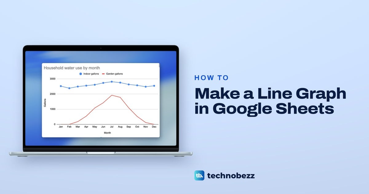
To make a line graph in Google Sheets, select your month labels and numbers with their headings, then click Insert > Chart. Sheets may draw a column chart first, so open Chart type and pick Line chart. If you selected only one number column, widen the Data range to the next one, then click Add Series for a second line.
We built ours in Chrome from our Household Water Use sheet, twelve months of indoor and garden water use. Three results are worth knowing before you start. Sheets drew columns before we asked for a line, a wider data range did not bring the second line in, and an empty cell broke the line where a typed 0 pulled it down to the axis.
The short version
- Make it: select the label column and the numbers with their headings, then choose Insert > Chart.
- Pick the line: in the Chart editor, open Chart type and choose Line chart in the Line group.
- Second line: if you selected only one number column, widen the Data range to the next one, then click Add Series, because the wider range alone did not add it for us.
- Gap or dip: an empty cell breaks the line, while a 0 pulls it down to the axis.
- Titles: retype them under Customize > Chart & axis titles, since the vertical axis kept Indoor gallons as its label in our chart.
- Save it as a picture: use the chart's three-dot menu, then Download chart.
Line graph settings at a glance
| What you want | Where it is | What we saw |
|---|---|---|
| Make the chart | Insert > Chart, with the labels and numbers selected | A column chart titled Indoor gallons vs. Month |
| Switch to a line | Setup > Chart type > Line chart | One blue line from Jan to Dec |
| Add a second line | Setup > Data range, then Add Series | A red Garden gallons line and a legend with both names |
| Months showing as the lines | Untick Setup > Switch rows / columns | Ticking it made Jan and Feb the lines |
| A dot on each value | Customize > Series > Point size | 7px put a dot on every month of the chosen line |
| A straight trend line | Customize > Series > Trendline | A pale line rising slightly through the year |
| Your own titles | Customize > Chart & axis titles | Household water use by month, with Gallons on the side |
| Show a missing month | Leave its cell empty | The line broke, where a typed 0 dropped it to the axis |
| A picture of the chart | Three-dot menu > Download chart | PNG, PDF and SVG |
A line graph suits values that follow each other in time, such as months, weeks or years. For parts of one whole, a pie chart in Google Sheets reads better, and our guide to making a graph in Google Sheets compares the other chart types. To compare amounts across categories instead, see our guide to making a bar graph in Google Sheets.
Set up your data for a line graph
Put the labels for the horizontal axis in the first column and each set of numbers in its own column to the right, with a heading at the top of each. Sheets puts the labels from the first column along the bottom of the chart and uses the headings in the first row as the names in the legend.
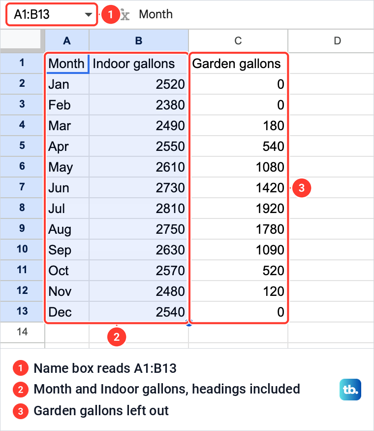
Our file, Household Water Use, has a tab named Monthly Use with three headings in row 1: Month, Indoor gallons and Garden gallons. Below them are twelve months, typed as Jan to Dec. The garden column holds three real zeroes, for January, February and December, the months with no garden watering.
Each line needs its own column of numbers. To compare a second measure, add a column in Google Sheets beside the first one and give it a heading, as Garden gallons has in ours. Because the headings become the names in the legend, rename the columns in Google Sheets if you want the legend to say something else.
For two lines, drag across all the columns, Month, Indoor gallons and Garden gallons in ours, before you insert the chart. For a single line, drag from the Month heading down to the last number in the column you want. We selected A1 to B13, and the Name box at the left of the formula bar read A1:B13, with Garden gallons left out for now.
Every selected row with a number in it becomes a point on the line, so leave a totals row out of the selection. If you want the year's figure as well, total a column in Google Sheets in a cell outside the chart's range.
How to make a line graph in Google Sheets
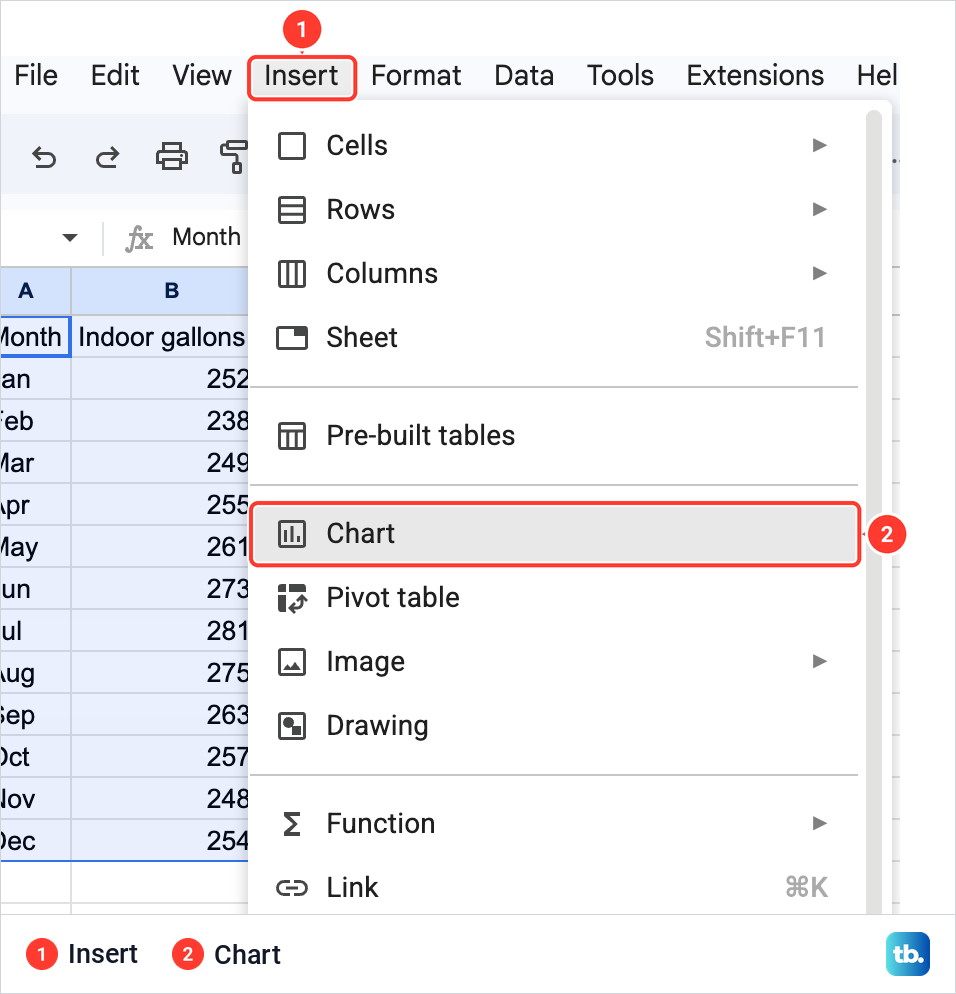
With the cells selected, open the Insert menu at the top and choose Chart. Sheets places a chart on the sheet, beside the selected cells, and opens the Chart editor in a panel on the right, on its Setup tab.
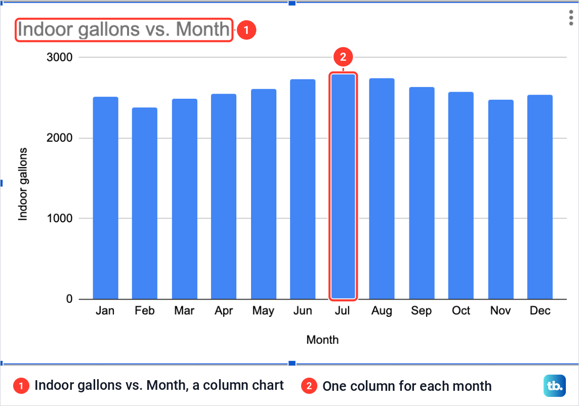
Our first chart was not a line. Sheets drew a column chart titled Indoor gallons vs. Month, with one blue column for each month. The Setup tab read Column chart under Chart type, None under Stacking and A1:B13 under Data range, so expect to choose the line yourself.
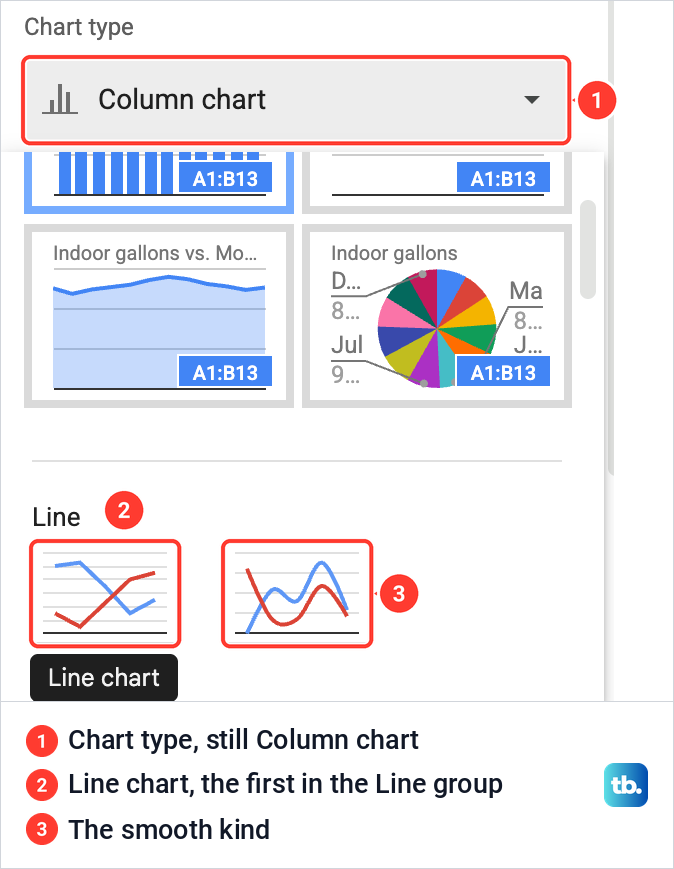
Click the Chart type box and scroll down past the suggested thumbnails to the Line group, which has two. Pointing at the first one showed the name Line chart, and that is the one to click. The second thumbnail is the smooth kind, with curved lines between the points.
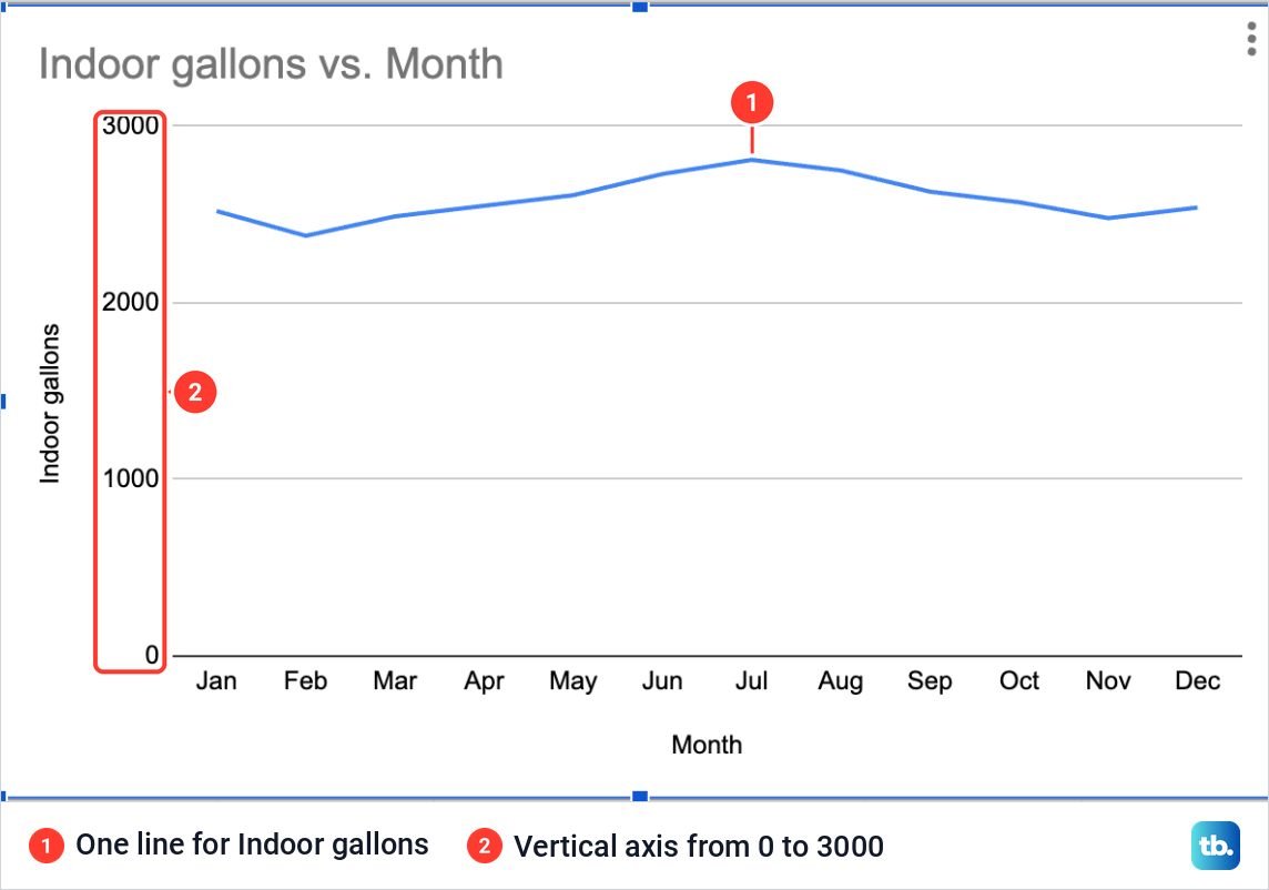
The columns turned into one blue line across the twelve months, on a vertical axis from 0 to 3000. The Setup tab then read Line chart, the Data range was still A1:B13 and the X-axis box showed Month, while the Stacking box had gone. If you close the panel, double-click the chart to open the Chart editor again.
The months ran along the bottom in the same order as the rows, Jan at the left and Dec at the right. If your first column holds real dates rather than month names, sort by date in Google Sheets first, so the line runs from the oldest value to the newest.
Add a second line to the graph
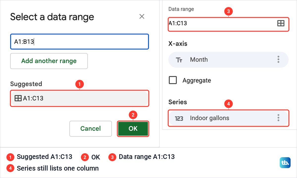
The obvious move is to widen the data range, and on its own it did not work. In Setup, the grid icon at the end of the Data range box opens Select a data range, which offered a Suggested range of A1:C13. We clicked the suggestion and then OK.
The Data range box then read A1:C13, but the chart still had one line, and the Series list under it still named only Indoor gallons. The garden numbers were inside the range and still not on the chart.
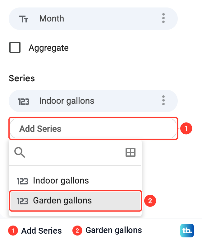
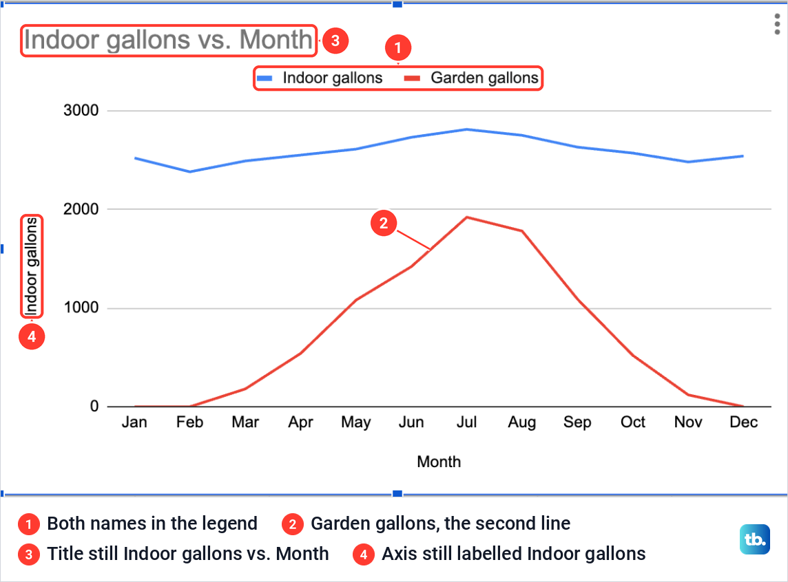
With the range widened, the fix is Add Series, under the Series list on the Setup tab. It listed both Indoor gallons and Garden gallons, and choosing Garden gallons drew a second line in red. A legend with both names appeared above the chart, and the Series list held both columns.
Both lines now share the chart, but two labels did not catch up. The title still read Indoor gallons vs. Month, and the vertical axis was still labelled Indoor gallons although it now measured both columns. The section on titles further down fixes both.
When the months turn into lines
Under the Series list on the Setup tab is a box named Switch rows / columns. Ticking it on our chart made Jan and Feb the only lines, and the other ten months disappeared. Each line ran from Indoor gallons to Garden gallons, which now sat along the bottom.
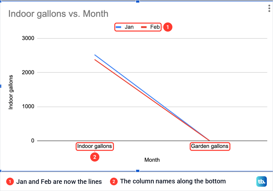
We pressed Command + Z on our Mac to put the chart back. On Windows and ChromeOS, undo is Ctrl + Z, or you can untick the box again. If your own chart shows month names in the legend and your column headings along the bottom, this box is the first thing to check.
Add dots and a trendline
The settings for each line sit on the Customize tab under Series. A box at the top picks the line you are changing, Indoor gallons in our case. Under it, Format holds Line color, Line opacity, Line dash type, Line thickness, Point size, Point shape and Axis, followed by Format data point and three boxes: Error bars, Data labels and Trendline.
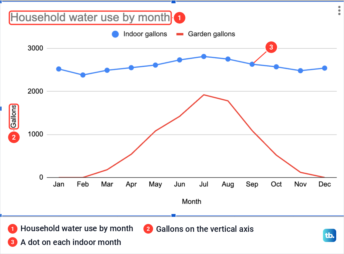
A plain line shows the shape of the year, but not where each month sits. Open Point size, which read None, and pick a size from 2px, 7px, 10px and 14px. With 7px, Indoor gallons got a dot on each month, and its marker in the legend turned into a dot too.
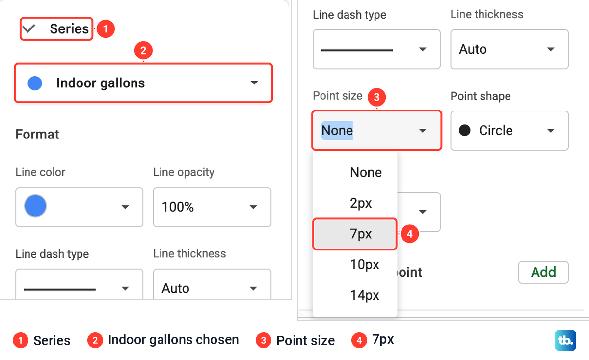
The setting changes only the line chosen in the box at the top, and our red line stayed without dots. Choose Garden gallons there to give it dots as well. To print each value next to its point, tick Data labels in the same section. If a second line uses another unit, such as dollars beside gallons, choose that line in the box and set Axis to Right axis, which gives it a scale of its own on the right.
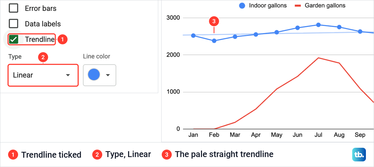
Ticking Trendline for Indoor gallons drew a pale straight line through that series, rising slightly from January to December. Its options are Type, set to Linear, Line color, Line opacity at 40% and Line thickness at 2px. Untick the box to remove it, as we did afterwards.
Change the chart title and axis titles
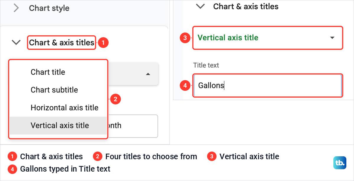
Sheets names a new chart after its columns, and ours kept those names after the second line went in. Open Customize > Chart & axis titles and use the box at the top to pick what you are editing: Chart title, Chart subtitle, Horizontal axis title or Vertical axis title.
Type the new words in the Title text box under it. We chose Chart title and typed Household water use by month, then chose Vertical axis title and typed Gallons in place of Indoor gallons. The horizontal axis already read Month, so it needed nothing.
The chart then carried its new title and Gallons on the vertical axis, with the dots from the last section on the indoor line. The boxes under Title text change the title's font and size if you want a different look.
Why your line has a gap or drops to zero
An empty cell and a 0 have different effects on a line chart. To check, we emptied the June garden cell, C7, with Delete. The Garden gallons line stopped at May and started again at July, with nothing drawn for June.
Then we typed 0 in the same cell. This time the line dropped to the bottom axis at June and climbed back up to July, the same way it sits on the axis for the real zeroes of January, February and December. We typed 1420 back in afterwards.
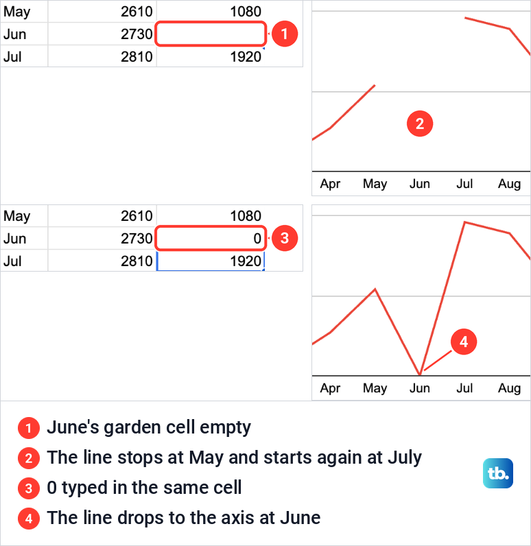
So use each one on purpose. Leave a cell empty when there is no reading for that period, and the break shows that a value is missing. Type 0 only when the amount really was zero, because the line treats it as a measurement. If a gap you did not expect appears, an empty cell in that row is one thing to check, and so is a 0 typed as a placeholder when the line dips to the axis.
Move, download or reuse the line graph
A new chart lands on top of the cells beside your selection. To move it, click an empty part of the chart and drag. It took us two drags to clear the table, and ours now sits to its right. Drag the blue markers on the edges of a selected chart to resize it.
Every chart has a three-dot button at its top right. Its menu lists Edit chart, Delete chart, Download chart, Publish chart, Copy chart, Move to own sheet and Alt text, and Download chart offers PNG image (.png), PDF document (.pdf) and Scalable Vector Graphics (.svg).
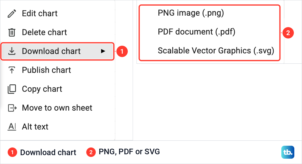
To put the graph in a Google Doc or a Slides presentation instead, open it and choose Insert > Chart > From Sheets, then pick the spreadsheet and the chart. The chart stays linked to the spreadsheet unless you untick Link to spreadsheet when you add it. Anyone who can open the document can see a linked chart, even without access to the spreadsheet itself.
Make a line graph in the Google Sheets app
The Google Sheets app for Android, iPhone and iPad makes a line graph from the same kind of table. Open the spreadsheet, select the label and number cells, then tap Insert (+), then Chart. If the app does not draw a line, tap Type, choose a line chart and tap Done.
To change the chart later, double-tap it and tap Edit chart. The app offers Type, Legend, Titles and Color, where Color changes the colors of the lines. Point size, Trendline and Add Series are not in that list, and all three are on the Customize and Setup tabs in Sheets on a computer.
How we tested this guide
We tested this in Google Sheets on the web in Chrome on a Mac, charting 12 months of household water use as one line and then two, and checking what an empty cell does to a line.
Frequently Asked Questions
How do I make a line graph with two lines in Google Sheets?
Put the labels in the first column and each set of numbers in its own column beside them, then make the chart and pick Line chart. If only one line appears, open Setup, check that the Data range takes in the other column, then click Add Series and choose it. A wider Data range on its own did not add the line in our chart.
Why did Google Sheets make a column chart instead of a line graph?
Insert > Chart picks a chart type for you, and for our month and gallons columns it picked a column chart. Open Chart type in the Chart editor and choose Line chart in the Line group.
Why is there a gap in my line graph?
An empty cell is one possible cause, so check the value for that month first. In our chart, an empty June cell broke the line between May and July, while a 0 in the same cell pulled the line down to the axis instead.
Why are the months showing up as separate lines?
Look at Switch rows / columns on the Setup tab. Ticking it on our chart made Jan and Feb the lines and put the column names along the bottom, and unticking it puts the months back on the horizontal axis.
How do I add dots to a line graph in Google Sheets?
Double-click the chart, open Customize > Series, choose the line at the top and set Point size to a size such as 7px. Repeat it for each line that should have dots.
Can I show the value at each point?
Yes. Open Customize > Series, choose the line and tick Data labels, and each point gets its value printed beside it.
How do I save a line graph as a picture?
Click the chart, click the three dots at its top right and choose Download chart, then PNG image (.png). PDF and SVG are in the same list.