
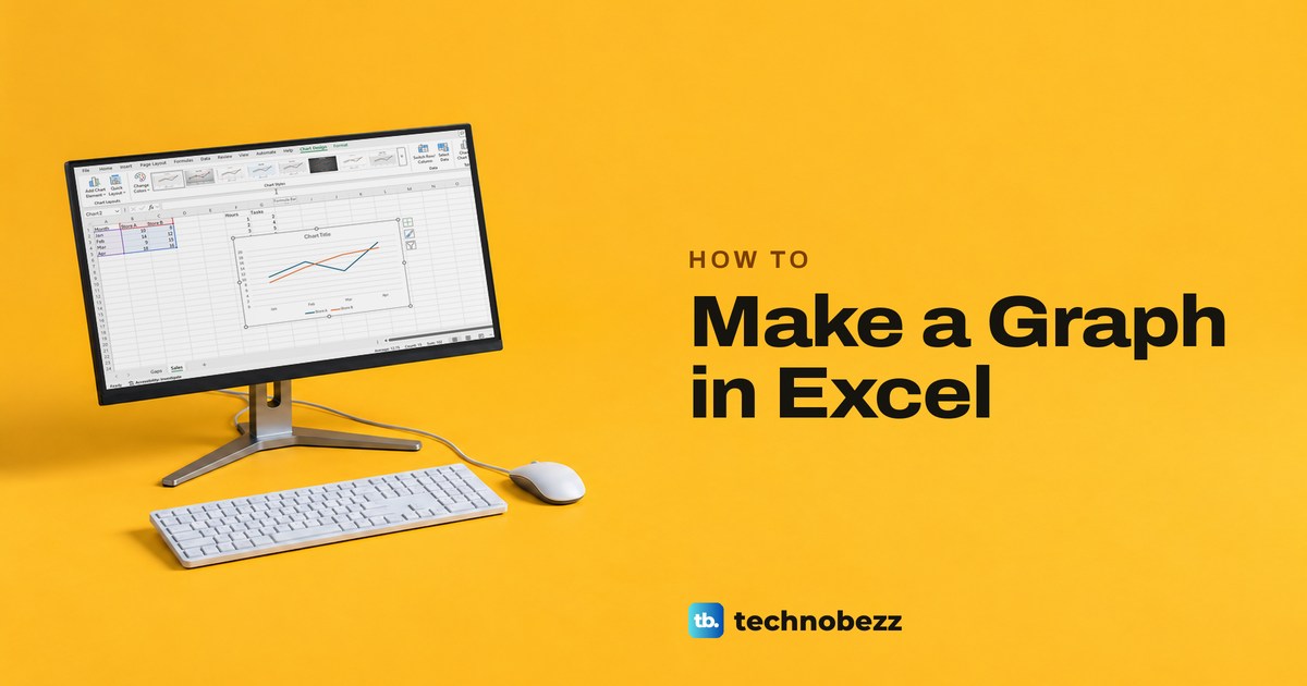
To make a graph in Excel, type your labels in one column and your numbers in the columns beside it, select the whole block including the headers, then choose Insert > Recommended Charts, pick a preview and select OK. Excel calls graphs charts, so look for the word chart on the ribbon, not graph. For measured X and Y pairs, choose a Scatter chart rather than a Line chart.
We built the examples below from a small table of made-up monthly sales for two stores, in Excel for Microsoft 365 on Windows 11, version 25H2, and in Excel for the web. The second half covers the repairs a new chart often needs: a missing series, a line that breaks at an empty cell, a hidden row that drops out and chart buttons that stay grey.
The short version
- Select the labelled cells, then Insert > Recommended Charts and OK.
- Column or Bar to compare, Line for a trend over time, Scatter for numeric X and Y pairs, Pie for one set of values.
- Select the chart to see Chart Design, where Add Chart Element adds a title, axis titles and data labels.
- A series missing? Widen the range in Select Data or unhide the column, then check the title and legend.
- Alt + F1 puts a chart on the sheet, F11 puts it on a sheet of its own and Ctrl + Q opens Quick Analysis.
Set up the data you want to graph
Excel builds a chart from a rectangle of cells, so lay the data out as a small table first. Put the category labels, such as months, in the first column and each set of numbers in its own column to the right, with a short header above each one. Excel uses those headers as the names in the legend, which Microsoft describes as the information in the cell above each column.
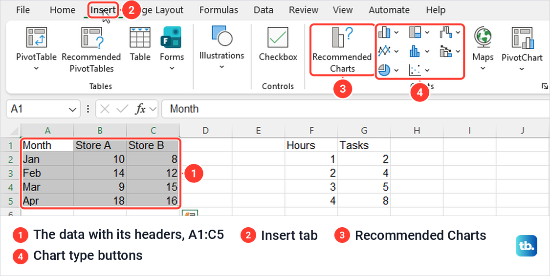
Our Sales sheet held Month, Store A and Store B in A1:C5, with Jan to Apr down the side. Select the whole block with its headers. Microsoft says you can also select any one cell in a continuous range and Excel takes the rest, but selecting the exact cells keeps a stray note or total beside the table out of the graph.
A little preparation saves a rebuild later. For a long list of individual sales, create a pivot table in Excel to total it by month first, then graph the totals. To show growth rather than raw numbers, calculate the percentage change in Excel in a column of its own and select that column instead.
A graph plots whatever the cells show, mistakes included. If a source cell shows an error or a result that looks wrong, fix the Excel formulas that are not working before you trust the picture. If you are still finding your way around rows, columns and cell ranges, our guide to using Excel for beginners covers the basics.
Make a graph with Recommended Charts
With the cells selected, open the Insert tab. The Charts group has a large Recommended Charts button, a block of small unlabelled buttons for the chart families, and labelled Maps and PivotChart buttons. Hover over a small button to see its name.
Select Recommended Charts to open the Insert Chart box. Its Recommended Charts tab lists previews down the left and shows a large preview with a short note on the right. For our two stores it offered Clustered Column first, then Line, Stacked Column, Stacked Area and Scatter, with the note A clustered column chart is used to compare values across a few categories.
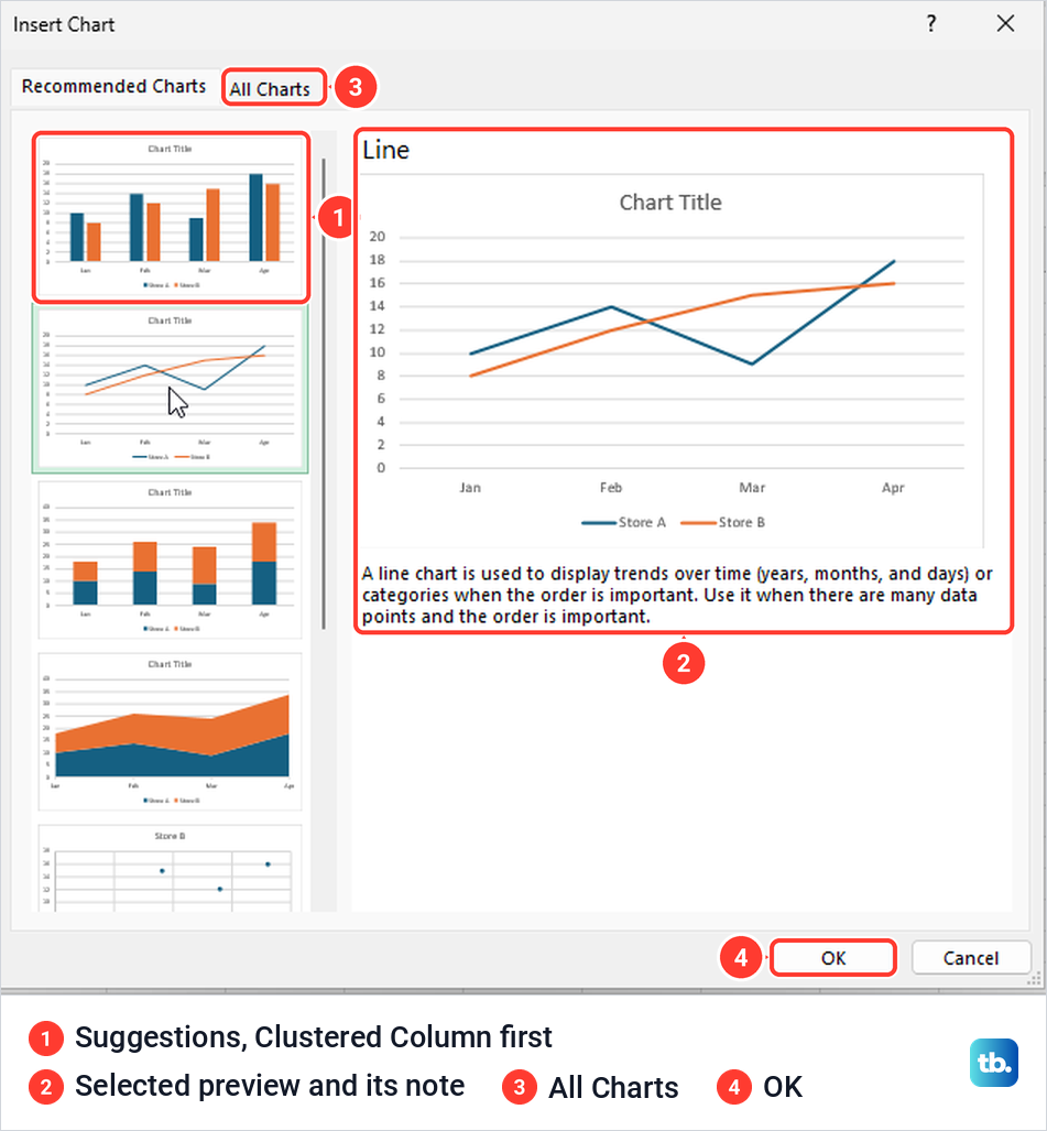
Select any preview to see it full size, then select OK. The All Charts tab holds every family, from Column, Line, Pie and Bar to X Y (Scatter), Waterfall, Funnel and Combo, for when none of the suggestions fits. Microsoft says the suggestions depend on the data you selected, so a different table gets a different list.
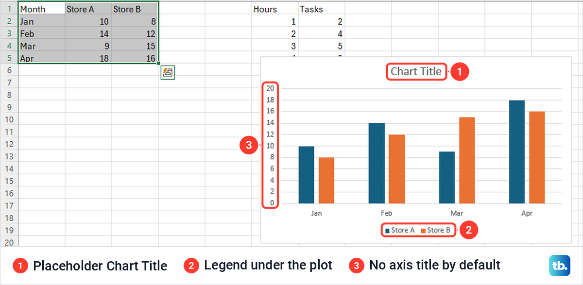
After OK, Excel placed the chart on the same sheet as the data. By default it had the placeholder text Chart Title, a legend under the plot and horizontal gridlines, but no axis titles and no numbers on the bars. Drag the chart by its border to move it out of the way of your cells.
Pick the chart type that fits your data
The right chart depends on what the numbers mean, not on how they look. Use this table to choose, then insert that type from its button or from the All Charts tab.
| What you want to show | Chart to choose | How to lay out the cells | Where to find it on the desktop |
|---|---|---|---|
| A comparison across a few categories | Clustered Column | Labels in the first column, one value column per series | Recommended Charts, or All Charts > Column |
| A comparison of items with long names | Clustered Bar | The same layout as a column chart | All Charts > Bar |
| A trend over months, weeks or days | Line | Periods in the first column, values beside them | The line button, then 2-D Line |
| How one measured number moves with another | Scatter | Numeric X values first, Y values in the next column | Insert Scatter (X, Y) or Bubble Chart |
| The shares of one whole | Pie | One label column and one value column | The pie button, then 2-D Pie |
Line chart for a trend
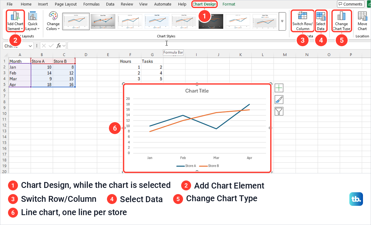
The line button opened a gallery headed 2-D Line, 3-D Line, 2-D Area and 3-D Area. Its first choice, Line, carries the tip Show trends over time (years, months, and days) or categories. One click on it inserted the chart, with no double-click needed, and drew one line for each store from Jan to Apr.
As soon as a chart is selected, Excel adds two tabs to the ribbon, Chart Design and Format. Chart Design holds the controls the rest of this guide uses: Add Chart Element, Switch Row/Column, Select Data and Change Chart Type. Click a cell and both tabs disappear, so select the chart first whenever a step sends you to them.
Scatter chart for X and Y pairs
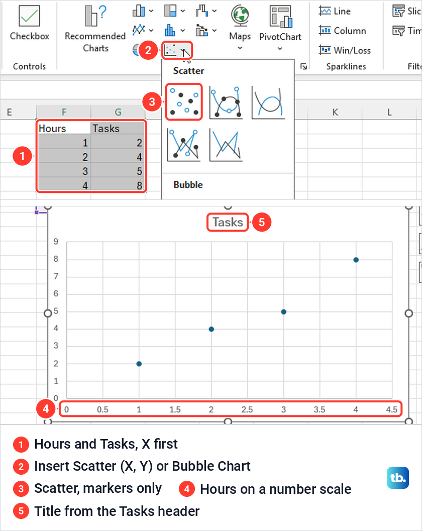
A line chart has one value axis and spaces its categories evenly. In Microsoft's own example, a line chart plotted the X numbers as values of their own, and Excel numbered the axis 1, 2, 3 because no categories were given. Real dates are the exception, since a line chart can use a date axis. For measured numbers such as hours worked, use a scatter chart, which Microsoft says always has two value axes.
We selected Hours and Tasks in F1:G5 and used the button whose tip reads Insert Scatter (X, Y) or Bubble Chart. Its gallery has five Scatter types and two Bubble types. The first, markers only, plotted four points with Hours on a true number scale from 0 to 4.5, and it took its title, Tasks, from the Y column's header.
Pie chart for one set of values
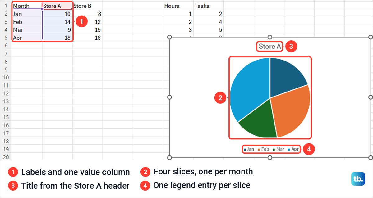
A pie shows the parts of one whole, so it uses a single column of values. Select the labels and one value column, then choose 2-D Pie from the pie button, where the gallery also offers 3-D Pie and Doughnut. From Month and Store A, Excel drew four slices, one per month, and named the chart Store A after the column header.
Bar charts take the same layout as column charts and are easier to read when the category names are long. For a timeline of tasks rather than a comparison of numbers, create a Gantt chart in Excel from the project dates instead.
Add a chart title, axis titles and data labels
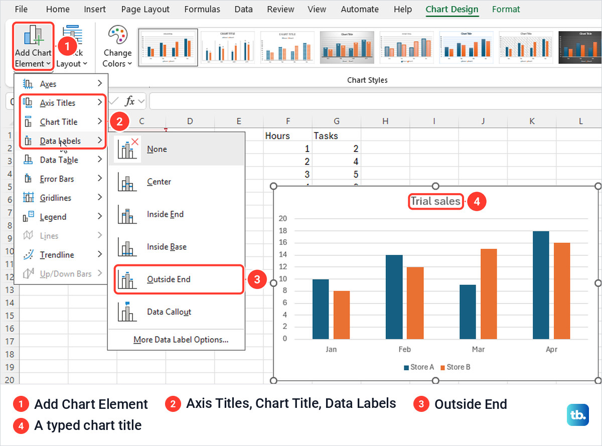
A chart without a real title or axis names leaves the reader guessing. Select the chart, open Chart Design and select Add Chart Element at the left end of the ribbon. Its menu lists Axes, Axis Titles, Chart Title, Data Labels, Data Table, Error Bars, Gridlines, Legend, Lines, Trendline and Up/Down Bars, each with its own submenu.
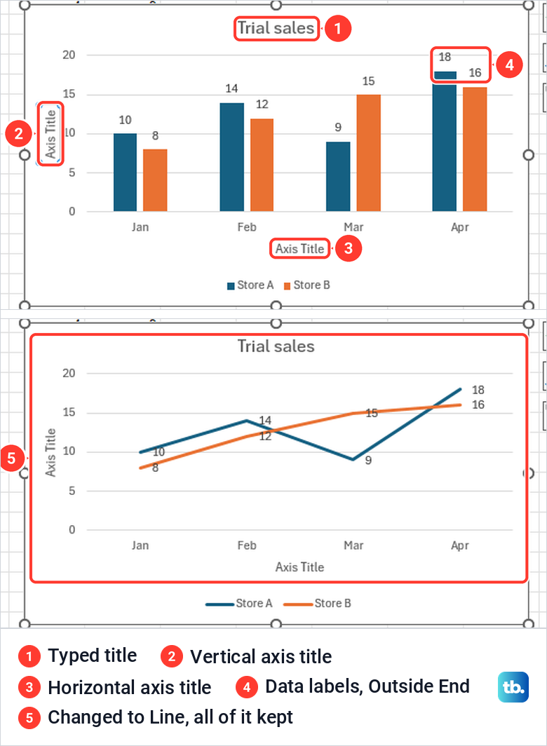
Under Chart Title, Above Chart puts the title over the plot. To replace the placeholder, click inside the title, press Ctrl + A to select its text and type your own, and we named ours Trial sales. Axis Titles offers Primary Horizontal and Primary Vertical, and each adds a box that reads Axis Title until you type over it.
Data Labels writes each value on its bar or point. The submenu offers Center, Inside End, Inside Base, Outside End and Data Callout, and Outside End put the numbers just above our columns. Use the same menu to add a legend if Excel left it off a chart with more than one series.
Change the chart type without starting over
You do not have to rebuild a chart to try another type. With the chart selected, choose Change Chart Type on Chart Design, pick a family on the All Charts tab and select OK. Microsoft also lists right-clicking the chart area and choosing Change Chart Type.
We turned our labelled column chart into a line chart this way. The title Trial sales, both axis titles and every data label came across, and the preview inside the dialog already showed them before we selected OK.
Fix a graph that is missing a data series
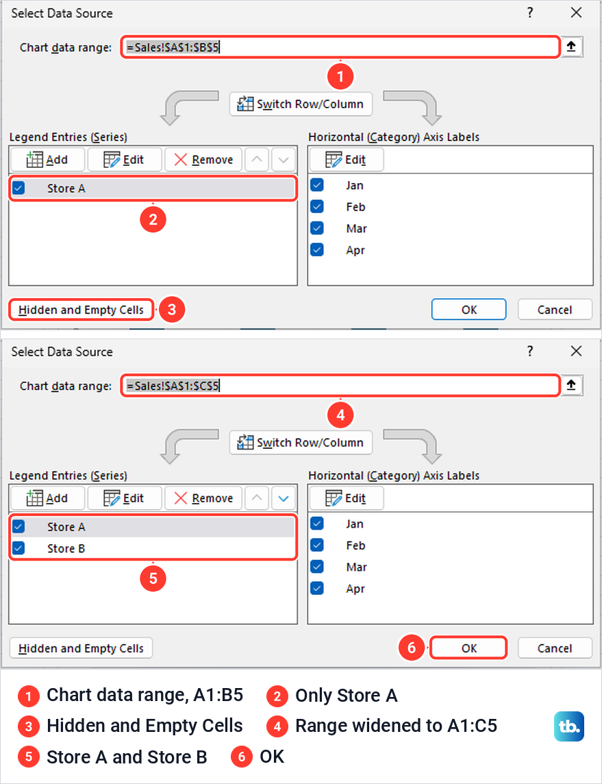
If a store, a year or any other column is missing from the graph, check the chart's source range first, because selecting one column too few is all it takes. If the range is right, the column may be hidden, since Excel leaves hidden data out of a chart by default, as the section on hidden rows below explains. Our chart built from A1:B5 showed Store A alone and used Store A as its title.
Select the chart and choose Select Data on Chart Design. The Select Data Source box shows the range in Chart data range, the series under Legend Entries (Series) and the labels under Horizontal (Category) Axis Labels. Ours read =Sales!$A$1:$B$5, with Store A as the only series.
Click in Chart data range, then drag over the full table on the sheet or type the range, and select OK. We typed =Sales!$A$1:$C$5, and when we opened the box again it listed Store A and Store B.
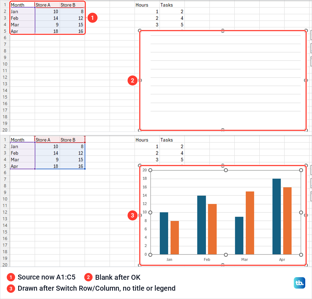
Then look at the chart itself, because ours did not redraw. After OK it showed gridlines and nothing else, and it stayed blank after we clicked away and scrolled. Clicking Switch Row/Column made it draw, and a second click put the months back along the axis.
The repaired chart showed both stores but had lost its Store A title, and it had no legend, so the two colours were unlabelled. After a change of source, check the title and the legend, and add back whichever has gone with Add Chart Element. If that is more work than it is worth, delete the chart, select the full table and insert a new one.
Swap rows and columns when the axis looks wrong
Excel decides which cells become the categories along the bottom and which become the series in the legend. If it picks the wrong way round, select the chart and choose Switch Row/Column on Chart Design. On our sales chart one click put Store A and Store B along the axis with a bar for each month, and a second click put Jan to Apr back.
The same button sits in the middle of the Select Data Source box. Use it for category charts such as columns and lines. It is not the fix for a scatter chart that plots the wrong numbers, where the X values need to sit in the first column of the selection.
Show blank cells and hidden rows in a graph
A line chart treats an empty cell as a gap by default. On our Gaps sheet Wed had no value, so the line ran from Mon to Tue and stopped. Thu still held 8, but it did not appear at all, because a point between a gap and the end of the line has nothing to join and this line style has no markers.
To choose what Excel does instead, select the chart, choose Select Data and then Hidden and Empty Cells in the lower left corner. The Hidden and Empty Cell Settings box opened with Gaps selected and Zero and Connect data points with line as the other choices. Show #N/A as an empty cell was ticked and Show data in hidden rows and columns was cleared.
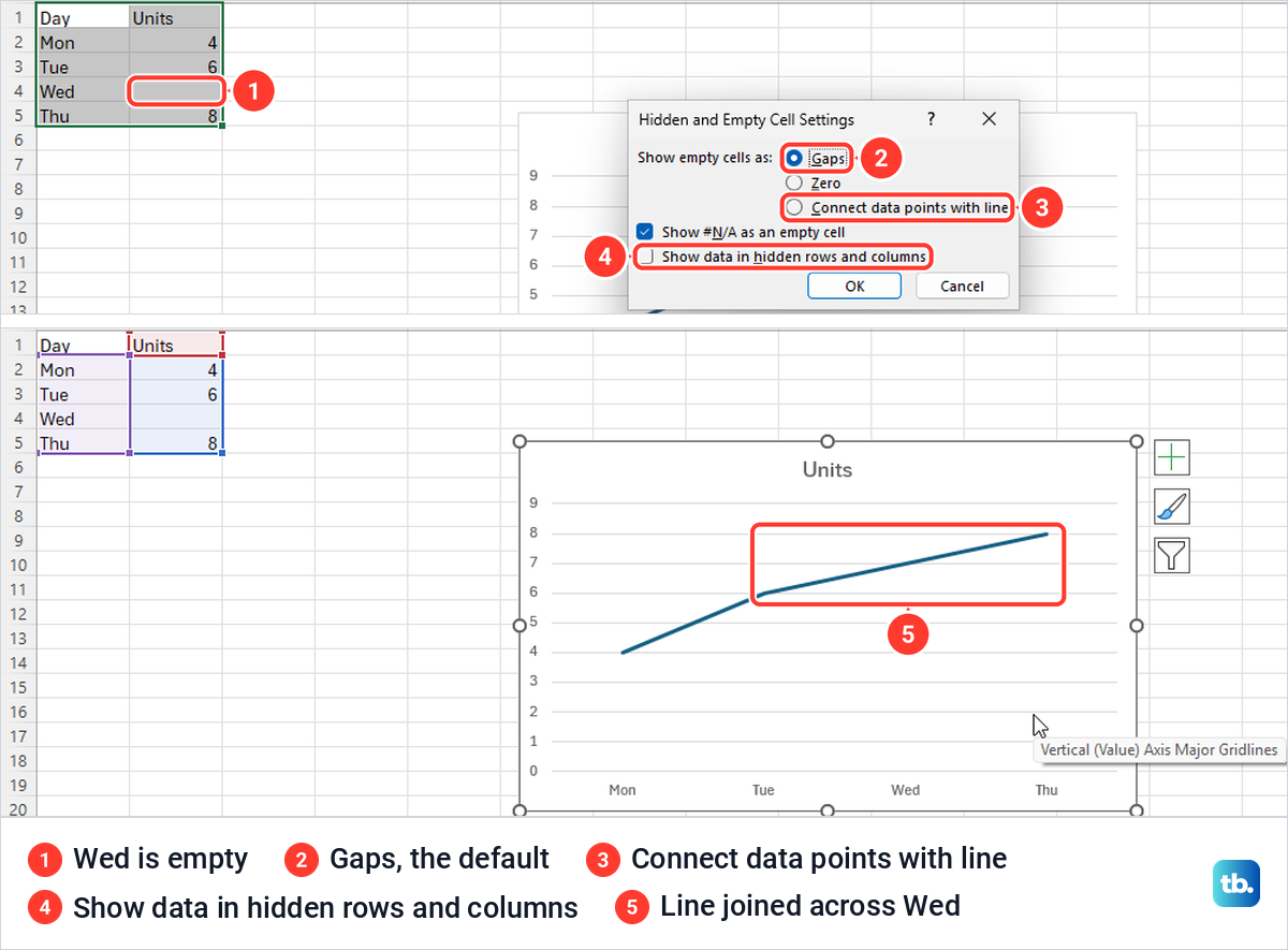
Pick the choice that matches what the blank means. Connect data points with line joined our line straight across Wed, which suits a reading that was missed. Zero plots the empty cell as 0, which only makes sense if nothing happened that day, and Gaps is the honest choice when the value is unknown.
Hidden rows behave differently. When we hid row 3, Tue disappeared from the chart altogether and the axis read Mon, Wed, Thu. Ticking Show data in hidden rows and columns in the same box brought Tue back while the row stayed hidden, which is useful when you hide rows in Excel to tidy a sheet but still want them graphed.
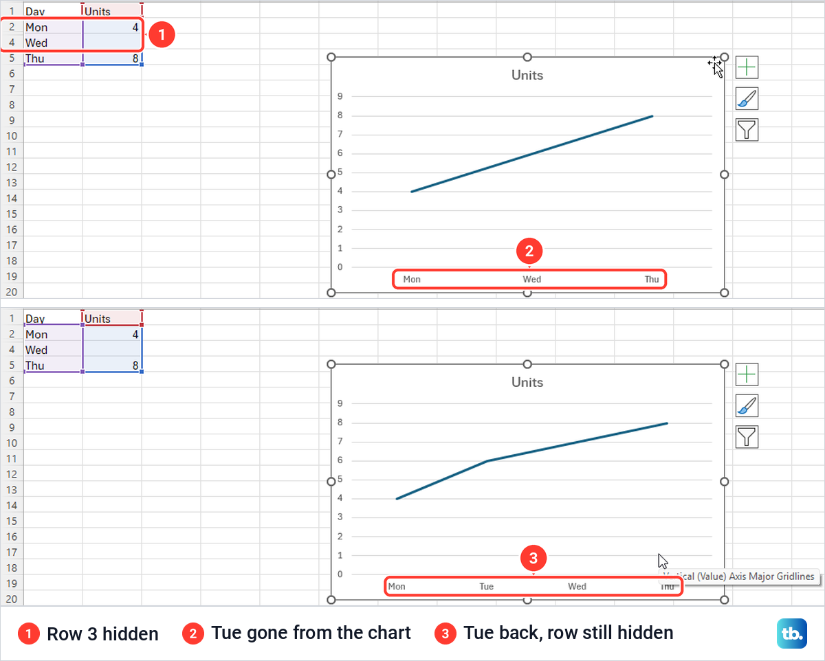
Microsoft's help says data in hidden rows and columns is not displayed in a chart by default, and the one setting covers both. To bring the cells themselves back into view instead, unhide the rows, or unhide the hidden columns in Excel if the missing series sits in a column you tucked away.
Make a graph faster with Quick Analysis or a shortcut
When you select a block of cells, a small Quick Analysis button appears at its lower right corner, and Ctrl + Q opens it from the keyboard. Its tabs are Formatting, Charts, Totals, Tables and Sparklines. For our data the Charts tab showed the same five suggestions as Recommended Charts, and a click on the first inserted a clustered column chart.
Two keys skip the menus completely. Alt + F1 put a clustered column chart straight onto our Sales sheet, and F11 created a new sheet named Chart1, placed before Sales, holding the chart on its own. Microsoft notes that Alt + F1 might not give the best chart for the data, so check the type afterwards.
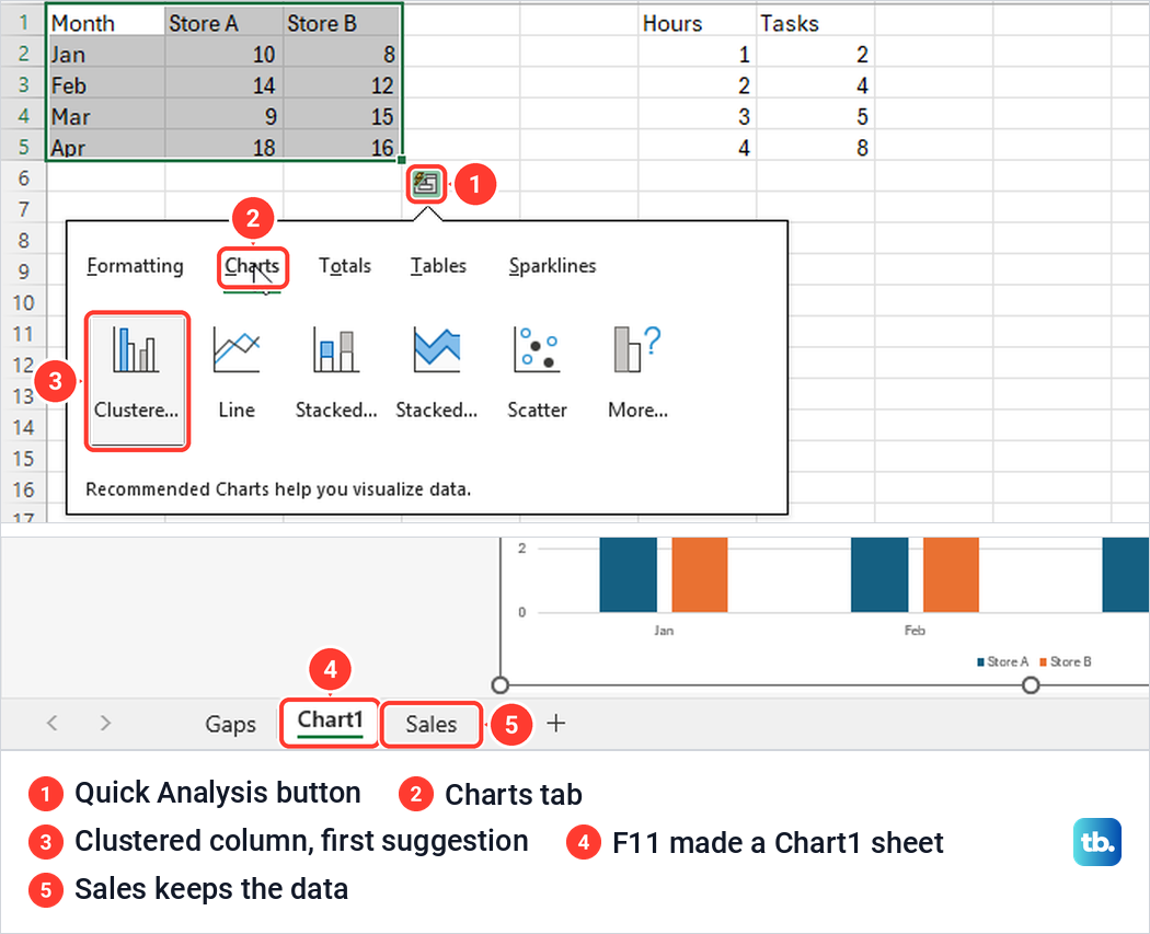
A chart sheet suits a graph you want to show full size, since there are no cells around it, and the data stays where it was. Our Sales cells were untouched after F11. Both keys sit alongside the other Excel keyboard shortcuts worth learning if you build charts often.
Make a graph in Excel for the web
Excel for the web builds graphs from the Insert tab too, but its ribbon is easier to read. The Charts group has labelled buttons for Recommended Charts, Column, Line, Scatter, Pie, Bar, Statistical, Combo and Other Charts. In Microsoft Edge we selected A1:C5, chose Column and picked the first 2-D Column, and the clustered column chart for both stores appeared on the sheet.
Selecting the chart adds a Chart tab rather than Chart Design. It has Switch Row/Column and Select Data at the left, the chart types in the middle, and Chart Title, Axis Titles, Legend, Data Labels and Data Table under Labels. If nothing happens when you try to add a chart, Microsoft says the workbook is probably in read-only view, and selecting Editing switches it.
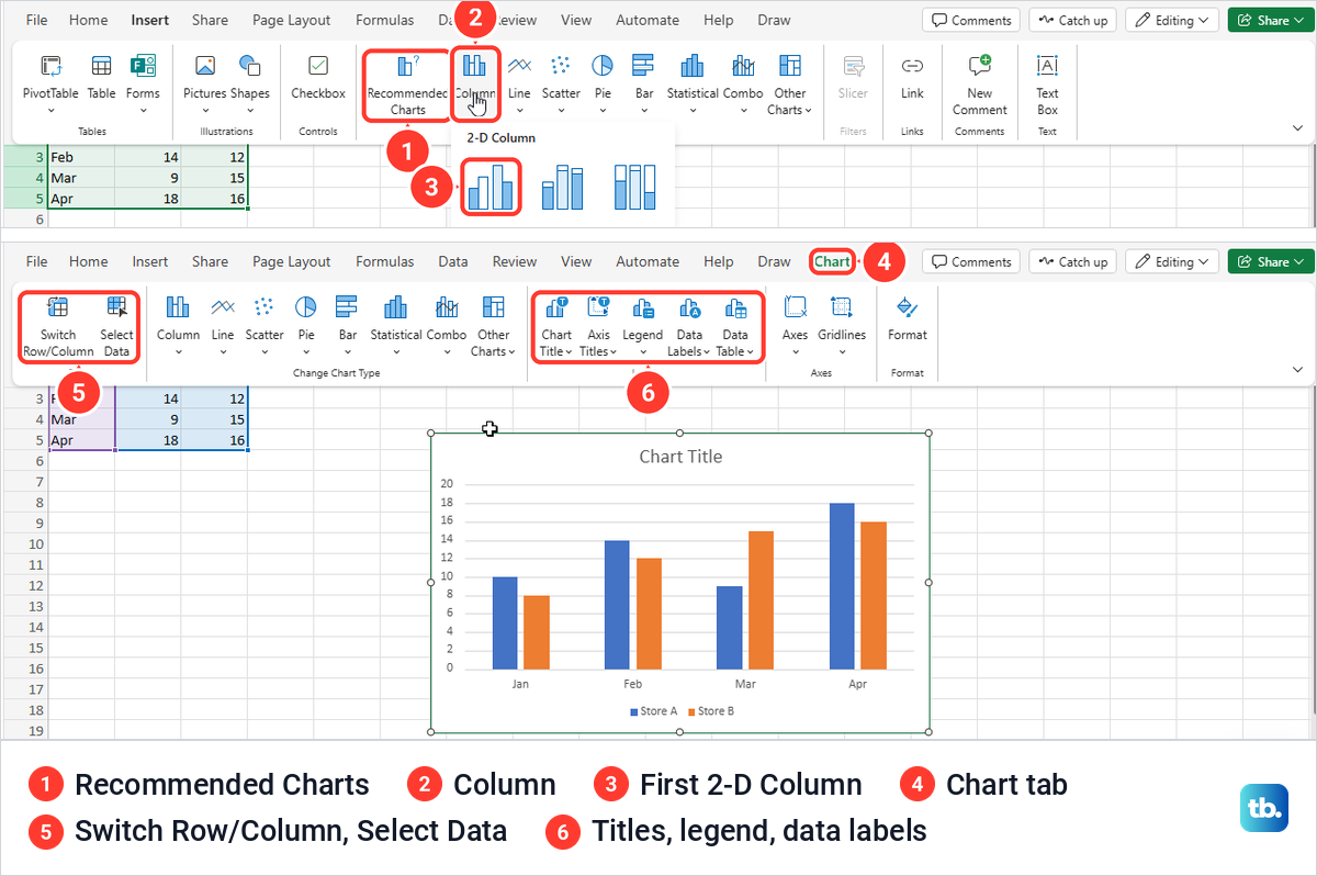
Recommended Charts is not a dialog box on the web. It opened a pane on the right with a card for each suggestion, a pie, a column and a bar chart for our A1:B5 selection, each with an Insert Chart button. The column chart we inserted was titled 'Store A' with quote marks, had the axis titles Month and Store A and had no legend.
Microsoft says these web recommendations are available to Microsoft 365 subscribers in English, French, Spanish, German, Simplified Chinese and Japanese. If the pane does not appear for you, pick a type from the labelled chart buttons beside it instead.
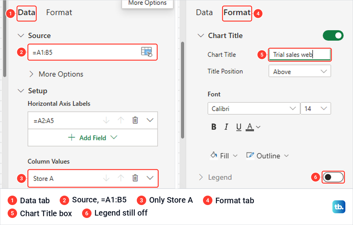
To repair the source on the web, right-click the chart and choose Select Data. A Chart pane opens on its Data tab, with the range in a Source box that read =A1:B5 on our sheet. We changed it to =A1:C5 and pressed Enter, and Store B joined the chart at once, with none of the blank redraw we saw on the desktop.
The vertical axis title still said Store A and the legend stayed off, so the colours were unlabelled again. Open the pane's Format tab, switch Legend on and correct the axis titles. Typing in its Chart Title box renamed our chart Trial sales web.
When the chart buttons are grey or missing
If you cannot find Chart Design, Select Data or Add Chart Element, the chart is not selected. Click the chart's border or an empty area inside it, and the Chart Design and Format tabs come back.
If every chart button on the Insert tab is grey, one cause is a protected sheet. On our protected sheet Recommended Charts and the whole Charts group were greyed, and the existing chart could not even be selected or dragged. Excel showed no message at all, which makes it easy to mistake for a frozen chart.
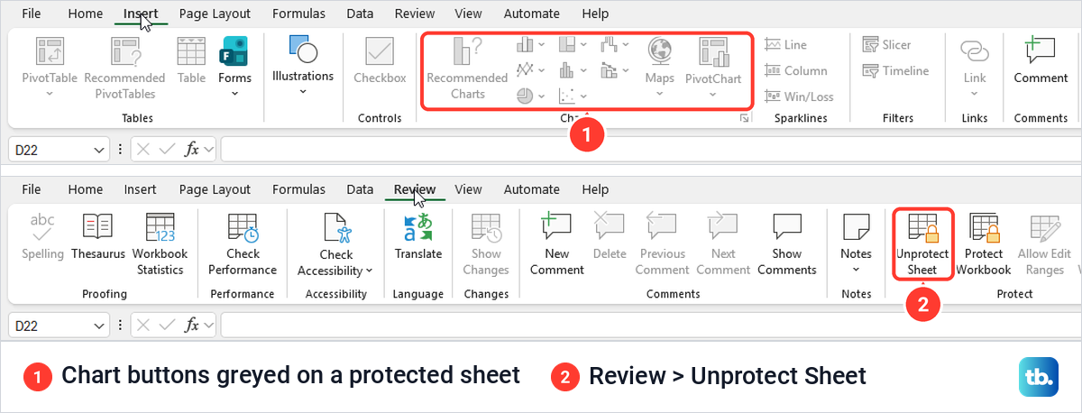
Protect Sheet leaves Edit objects unticked by default, and Microsoft's help says that option covers changes to embedded charts. If you have permission to edit the sheet, choose Review > Unprotect Sheet, and our chart moved normally after that. A sheet protected with a password asks for it first, and our guide to unprotect an Excel worksheet covers that step.
If the sheet was protected on purpose to lock cells in Excel, protect it again when you are done. Tick Edit objects in the Protect Sheet list if other people should still be able to change the charts.
How we tested this guide
We tested this in Excel for Microsoft 365 on Windows 11, version 25H2, and in Excel for the web in Microsoft Edge, graphing made-up monthly sales for two stores.
Frequently Asked Questions
What is the difference between a graph and a chart in Excel?
None in practice. Excel's menus call every graph a chart, so look for Recommended Charts, Chart Design and Change Chart Type when a guide says graph.
How do I make an X and Y graph in Excel?
Put the X numbers in the first column and the Y numbers in the next, select both with their headers and choose Insert Scatter (X, Y) or Bubble Chart, then Scatter. A line chart has only one value axis, so it would not place the points by their X numbers.
Why does my chart show only one data series?
Usually its source range stops before the other columns, or a source column is hidden. Select the chart, choose Select Data, set Chart data range to the full table and select OK, then check that the title and legend are still there and add back any that went missing with Add Chart Element.
How do I put a graph on its own sheet?
Select the data and press F11, and Excel adds a separate chart sheet, which was named Chart1 in our workbook. Alt + F1 keeps the chart on the sheet with the data instead.
How do I stop a line graph breaking at an empty cell?
Select the chart, choose Select Data, then Hidden and Empty Cells, and pick Connect data points with line. Gaps is the default and leaves the break.
Can I make a graph in Excel on a Mac or a phone?
Yes. Microsoft's Excel for Mac steps are to select the data, click the Insert tab, then click Recommended Charts or a specific chart type. On an iPhone or Android phone, drag the handles to select the data, tap the Edit icon, tap Home, tap Insert and then tap Recommended to see the charts Excel suggests.
Why are the chart buttons grey in Excel?
One cause is a protected sheet, which greys the Insert tab's chart commands without any message. Choose Review > Unprotect Sheet if you are allowed to edit it, and in Excel for the web select Editing if the workbook opened read-only.