

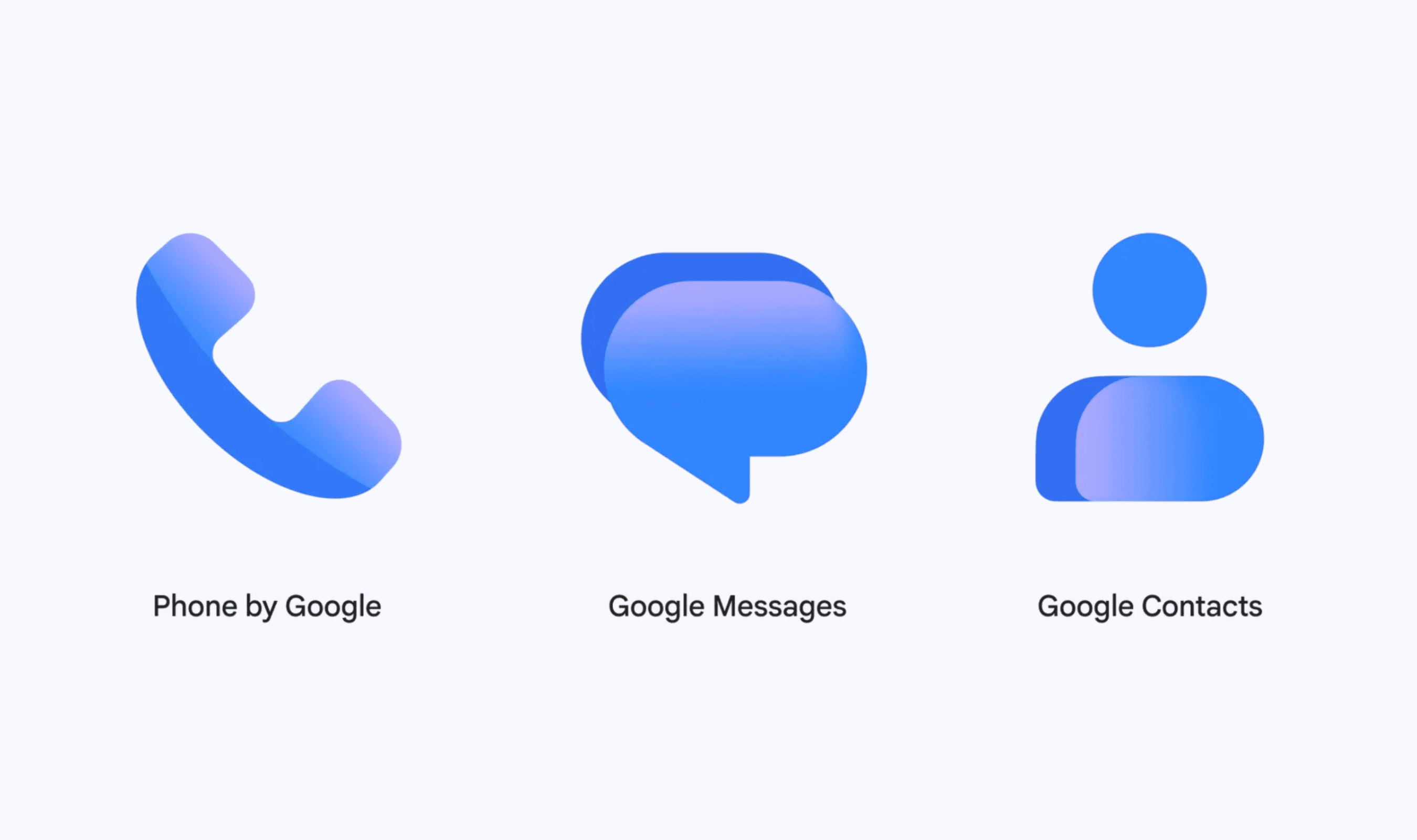
Google Messages, Phone by Google, and Google Contacts are getting redesigned icons, with distribution beginning November 2 and continuing over the coming weeks. Google says the visual changes will leave the three apps’ functionality intact, so the new home screen appearance does not bring a corresponding feature update.
The designs introduce a restrained gradient and more distinct edges, which Google says should make the icons easier to recognize on a home screen. Google also adjusted their curves and colors to bring them closer to its other app designs and the main Google logo.
Read more: Google Messages May Bring Message Editing Feature in Upcoming Update
Google says user feedback helped shape the refreshed designs across the three communication apps. The company describes the intended result as a clearer appearance and greater visual consistency when users see the icons on their home screens.
Earlier this year, a Google Messages beta teardown surfaced work on live location sharing, including options to share for an hour, the rest of the day or a custom period. That discovery also included a conversation banner showing the remaining sharing time and a way to stop sharing, but public release timing had not been established.