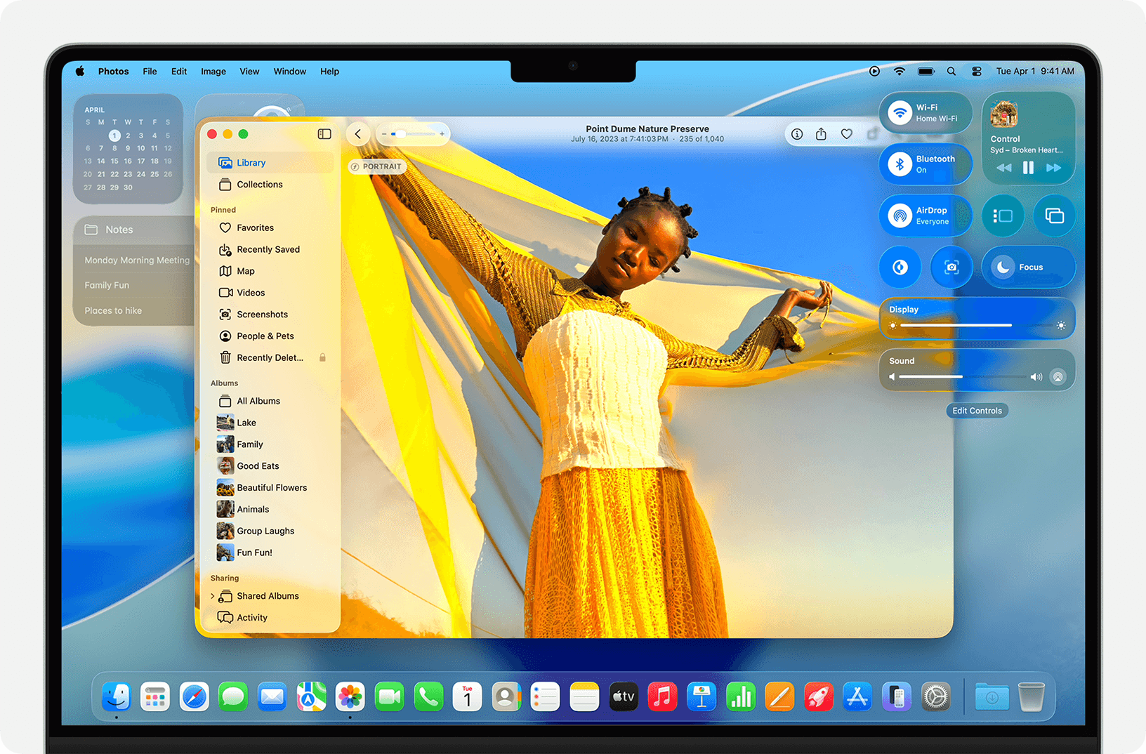
Apple's macOS Tahoe adds icons to nearly every menu item, creating a cluttered interface that violates the company's own design principles established over three decades.
The operating system's menu icons face criticism for inconsistency and poor execution. Software engineer Nikita Prokopov and designer Jim Nielsen documented how Tahoe uses five different icons for the "New" function across various apps, while reusing identical symbols for unrelated actions like creating notes and editing addresses.
Apple's 1992 Macintosh Human Interface Guidelines explicitly warned against icon overload, stating "Don't use other, arbitrary symbols in menus, because they add visual clutter and might confuse people." The 2020 guidelines maintained this position, advising developers to "use icons in menus only when they add significant value."
Tahoe's 12x12 pixel icons often appear blurry due to vector-based symbol fonts that sacrifice clarity for scalability. At this size, thin strokes disappear and small symbols lose meaning, forcing users to interpret microscopic details rather than scanning menus efficiently.
The interface design breaks fundamental usability rules by using the same icon for different functions while assigning different icons to identical actions. This inconsistency prevents users from developing reliable visual patterns, slowing navigation instead of accelerating it.
Some designers suggest Apple may have adopted Google's approach to menu icons to attract users familiar with that ecosystem. However, the execution lacks the restraint that previously defined Apple's interface design philosophy.
The criticism arrives as Apple undergoes design leadership changes, with key personnel reportedly departing for other companies. Industry observers note this could signal a broader shift in Apple's approach to user interface consistency and clarity.
Prokopov's analysis includes specific examples from Finder, Notes, and Contacts applications, showing how identical icons serve different purposes while similar functions receive varied visual treatment. His suggested improvements involve reducing icon density and implementing color coding for better visual hierarchy.
Menu icons should highlight differences to aid scanning, but Tahoe's uniform approach eliminates visual contrast. When every item has an icon, none stand out, defeating the purpose of visual cues in interface design.
The operating system's icon problems extend beyond menus to broader interface elements, though menu icons represent the most visible departure from Apple's established design standards. Users upgrading to Tahoe will encounter these changes throughout the system's native applications.
Design consistency has been a hallmark of Apple's software philosophy since the original Macintosh interface guidelines. Tahoe's approach marks a significant departure from that tradition, prioritizing visual density over functional clarity.
Interface experts note that good design principles remain constant despite technological advances. Human visual perception and cognitive processing haven't changed since 1992, making Apple's original guidelines still relevant for modern interfaces.
The controversy highlights ongoing debates about interface design in an era of increasing visual complexity. As software adds more features, designers face constant pressure to balance functionality with usability, often struggling to maintain clarity amid expanding capabilities.
Apple hasn't publicly addressed the icon criticism or explained the design decisions behind Tahoe's menu system. The company typically reserves comment on interface design choices unless they represent major platform shifts announced at developer conferences.
Users encountering Tahoe's icon-heavy menus can expect a learning curve as they adapt to the new visual language. The changes affect core productivity applications where menu navigation represents daily workflow for millions of professional users.
The design discussion extends beyond aesthetics to fundamental questions about how software should communicate functionality. Icons serve as visual shorthand, but their effectiveness depends on consistent application and clear metaphorical connections to underlying actions.
Tahoe's release continues Apple's pattern of annual macOS updates, though interface changes of this magnitude typically receive more gradual implementation. The sudden shift to icon-heavy menus surprised many long-time Mac users accustomed to the platform's restrained design approach.
Future macOS updates may refine the icon system based on user feedback and design analysis. Apple historically adjusts interface elements between major releases, though core design decisions often persist throughout an operating system's lifecycle.
The icon controversy represents one aspect of broader interface changes in Tahoe, including the Liquid Glass visual theme that has drawn comparisons to Windows Vista. Together, these elements signal Apple's evolving approach to desktop interface design in an increasingly mobile-dominated computing landscape. Other macOS Tahoe issues have also been reported by users.