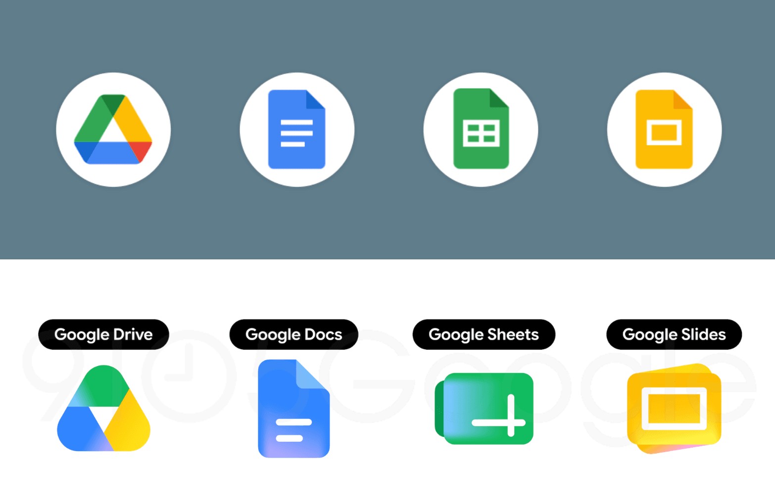
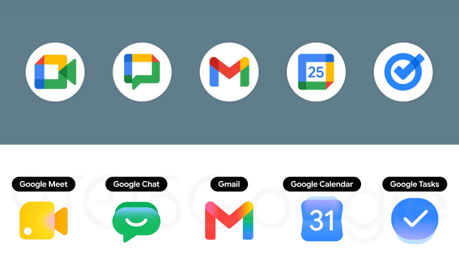
Google is scrapping the flat, four-color icon design that made its Workspace apps nearly indistinguishable in the app drawer, replacing it with gradient-heavy logos that prioritize individual identity over brand uniformity. The redesign covers 13 apps including Gmail, Drive, Calendar, Meet, Chat, Docs, Sheets, Slides, Keep, Tasks, Voice, Forms, and Sites.
Sources familiar with the plans shared early renders with 9to5Google, which published the first look over the weekend. The biggest change: Google is abandoning its long-standing mandate that every app icon cram all four company colors (red, yellow, green, blue) into a single square. The result is icons that finally look distinct.
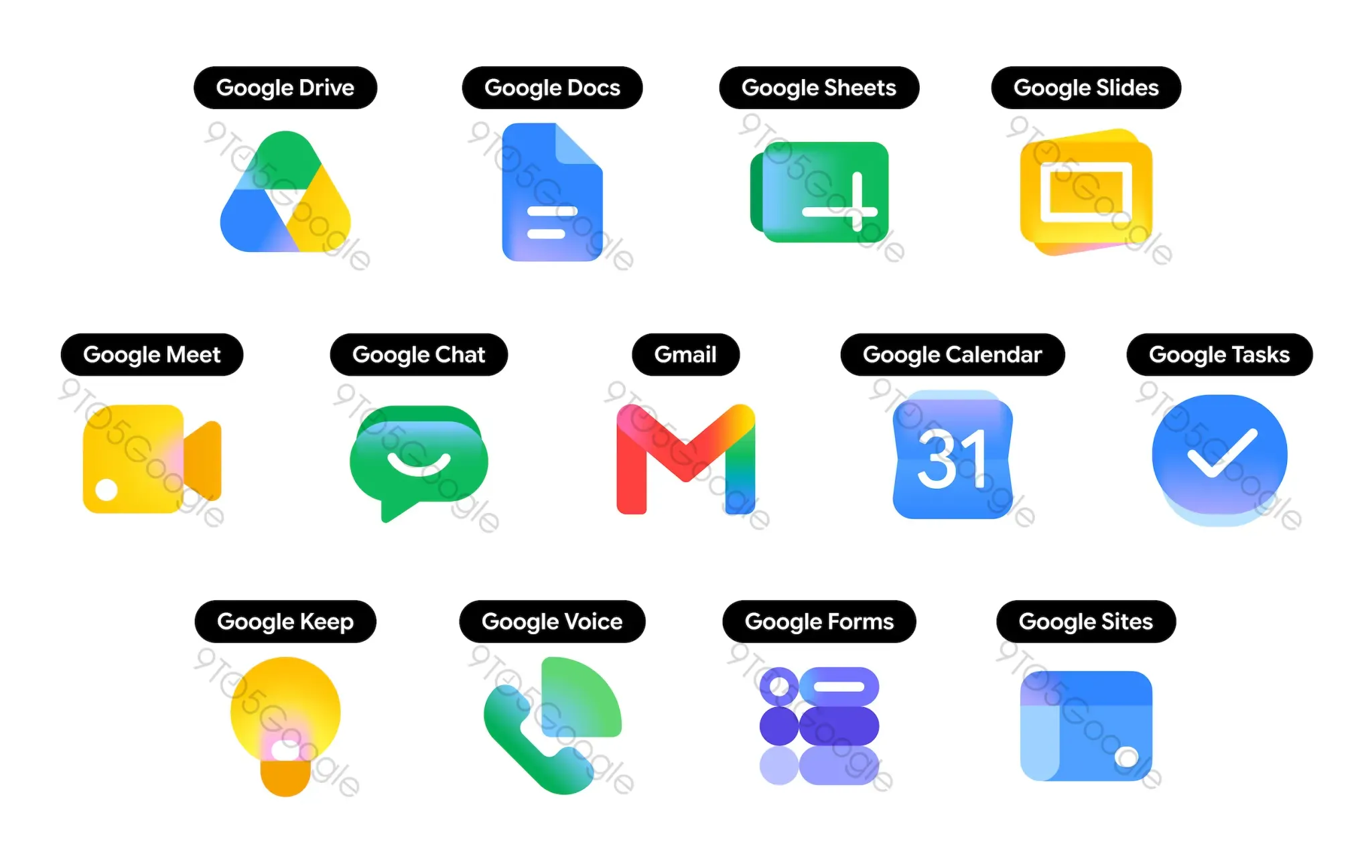
Drive drops red entirely and uses only green, yellow, and blue inside a rounded triangle that replaces its former page-container shape. Calendar returns to a classic blue flip-style design with a date on it, a throwback to older versions of the app.
Meet switches to bold yellow as its primary color while keeping the video camera silhouette.
Gmail gets the lightest touch. The familiar M envelope shape stays mostly red with small accents of yellow, green and blue, making it the only new icon still using all four Google colors.
Chat adopts a green pill-shaped bubble with a smile drawn inside.
Sheets and Slides rotate to landscape orientation, a practical nod to how people actually use those apps. Keep removes its page background entirely so the light bulb stands alone.
Tasks keeps its checkmark inside what resembles a tappable button. The gradient treatment mirrors what Google first applied to Maps and Photos late last year. According to 9to5Google's sources, the redesign is being discussed internally as a way to signal AI-powered features baked into each app.
Google has not released these icons through any server-side update or beta channel yet. Droid-Life suggests the rollout could arrive around Google I/O in the coming weeks.